
Like some sexually charged romance from a telenovela, I have a love/hate relationship with frequency separation. I love it because it just works so well, and the hatred exists because it is abused and lends itself to be so easily abused. If you don’t have a proper foundation in Photoshop, or, at least, the theory behind frequency separation, it can be a cruel mistress that betrays you on a whim.
I’m often uncertain about recommending it as a ‘tool’ to us particularly for Photoshop virgins or those lacking a foundation deeper than a summer puddle, because, predictably, a recurring motif that prevails when they use FS is a highly overdone image. It’s quite incredible, really, to see how many people implement frequency separation as part of their workflow with all the best intentions and then what they end up with is something that looks like an early 80s mall-portrait, with pore-less alabaster skin and haze à la ‘Glamour Shots By Deb’. Where are they going wrong?
Our SLR Lounge Critique section is growing and your submissions range from those of a very beginner to the very accomplished, and our aim is to help you reach that next step regardless of your starting point. I’ve been noticing a trend stemming from this problem with frequency separation so I figure it’s good to address it here. If you’re one of those struggling, don’t for a moment feel poorly, because you’re in good company.
Frequency Separation can go wrong at many points, and while there are actually variations of the process and different ways to use it, I believe there are two points where most stumble the most.
- Actions
- Blur Radius (This is the real killer)
Actions
Because frequency separation (FS) is a bit of a ‘household name’ now, even complete greenhorns fresh to Photoshop want to use it, and do. I don’t blame them, I did too. The problem is you’ve got to really understand what’s going on during frequency separation each step of the way in order to work it right. While actions are great, they do little for education and offer no explanation. You could, sort of, reverse engineer an action in some instances, but, my advice is to take the time required to understand what’s going on, and manually employ FS until it becomes as effortless as breathing.
Blur Radius
Now, as a disclaimer, I’m going to mention that not everyone has the same tastes, and not every project calls for the same result, so you must use your own discretion to decide how far you’re going to push this technique. Also, I’m not going to go into the specifics on how to build the FS workflow since it’s been done a million times before. See this article for a breakdown.

Alright, this is the big point. Simmered and reduced to the absolute basics, the separation in frequency separation refers to the separating of a low and high layer, typically with one aligned for tones and one for textures. These two layers are basically a single image broken into two, and this is how you should be thinking while using the method; The low layer deals with color/tones, and the high layer the texture and fine detail, and as they are split in different layers, you can work on each without disturbing the other.
The most insidious, if not common mistake I see comes right at the point of set-up, and regards the blur radius set for the low layer. It’s this blur radius that seems to trip people up, and mostly because they don’t understand what’s trying to be achieved at this point, or if they’ve watched some incomplete tutorial they see the radius number set and think this is what theirs should be also. Don’t do this, you really just have to visually judge it – more art than science at this point.
The point of the blur layer is to get to blur the image right to the point where texture falls away and just leaves color and the visible color transitions. That’s it. The problem is it can be a bit tricky to tell where this point is, and the radius value is going to vary on many things. The value that’s right for your image will depend on the resolution of the camera used, the actual resolution of the image, and how large your subject is in the frame.

This is, of course, under the assumption you’re retouching a person. If you’re retouching a swimwear shot and you’ve included the whole body, the skin in relation to the rest of the image is going to make up less than would a closer facial portrait. The larger the subject in the frame, typically, expect your radius value to be higher, and it will likely be higher, too, if you’re shooting some really high resolution camera like a 5DR or MF.
[REWIND: THE MANY FACES OF FREQUENCY SEPARATION. ARE YOU DOING IT WRONG?]
It appears most people who don’t get this right pick a radius that is too high and too much tonal blurring occurs leaving your smaller transitions, the ones which help ‘carve’ the face, diminished, which can leave a sort of flat or unnatural look to the finished product.
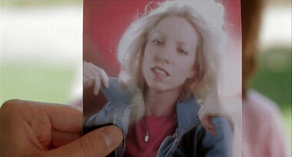
So that’s it really. I’ve included an example of what you should more be looking for versus what you shouldn’t in the image above. Just be careful with your radius, and remember, it’s not like you can only run FS on an image once. In fact, I do it numerous times when the occasion calls for it, so err on the side of less-is-more.


Get Connected!