Introduction
In this tutorial we’re going to go over how to make 2 different stylized looks for 1 photo. The Lightroom Presets v5 is a versatile system that can help you achieve many different stylized looks for your images. We will be using the Vivid Stylized Presets to create a more vivid or high contrast look, and complimenting that look with a Curve preset that will stylize our photos.
[Note: In the new Lightroom Presets v5, we have revamped all of the presets to improve image tonality and quality, allowing you to achieve even more amazing results. We’ve also added 95 new presets to reach a total of 311 presets in what is the gold standard of Lightroom image processing. In this series we’ll be going over how to use the new v5 presets to create great looking photos. Click Here to learn more or purchase the system.]
With each of our Ordinary to Extraordinary Edits, we’re going to first be going through how we create our effects with the SLR Lounge Lightroom Presets v5, then we’ll be going through the details in the develop settings so everyone can understand exactly how we get to a specific look. This way, whether you have the presets or not, everyone can benefit from watching this video or reading the article below.
Lightroom Presets v5 Mixology Recipe
For those who have the Preset System, you can follow the Mixology Recipe below to get to the same results. If you don’t have the Preset System, please continue to watch the full video tutorial, or read the written article below.
My Mixology
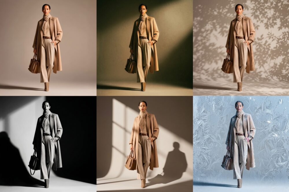
Cool Teal
- 01-30 BASE – VIVID STYLIZED: 43a. Dark Fade – Color
- 02-10 CURVES – COOL: 15a. Dark Wash – Teal
- 03-30 ADJUST – CONTRAST: 36 Contrast Boost – Light
- 04-00 SFX – COLOR SCHEMES: 02 Analogous, 02j. Green/Yellow
Warm Apricot
- 01-30 BASE – VIVID STYLIZED: 43a. Dark Fade – Color
- 2-20 CURVES-WARM – 25b DARK WASH: Apricot
- 03-30 ADJUST – CONTRAST: 36 Contrast Boost – Light
- 0-400 SFX – COLOR SCHEMES – 01 COMPLEMENTARY – 01b. Orange/Blue
Watch The Lightroom Video Tutorial
Read The Complete Written Tutorial
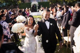
In this image, we used a Canon 5D Mark II and a Canon 50mm f/1.4 lens, with the aperture at f/2. I typically shoot at f/2 because it still provides a lot of nice bokeh, a slightly larger depth of field, and better sharpness than shooting it at f/1.4.

The first preset we’re going to apply to this image is the “01-30 BASE- VIVID STYLIZED – 43a. Dark Fade – Color.” This will apply a darkened fade to the image, and with less contrast in the highlights we won’t lose too much of the background building detail. Then we’ll raise the Exposure a little bit to get a nice overall fade.

Editing for the Cool Teal Vintage Fade Look
Following the BCAS format for developing, we’re going to modify the curve. Since we used a “Dark Fade” on the image, we can select any of the “Dark Washes” and it’s only going to affect the color tone.
We’re going to add some greens, and reduce some of the contrast by selecting these 2 presets.
- 03-30 CONTRAST: 36. Contrast Boost Light
- 0-400 SFX – COLOR SCHEMES – 02. Analogous – 02j Green/Yellow
Then we will adjust the Temperature/Tint to taste. We bring the Tint back to +25 and adjust the Temperature to 4750, to create a more neutral look with a hint of green toning. I adjusted the Temp down to bring in some yellow and Tint up to bring in some pinks.

In the Develop panel we see that the “Dark Fade” and “Contrast Boost” presets raised the Contrast and Shadows while lowering the Highlights, Whites and Blacks. These adjustments are what gives the photo a “Dark Fade” look. Clarity, Vibrance and Saturation have all been raised to put in some nice details and colors in the image. This photo also has our standard amount of Sharpening applied to it.
In our Tone Curve we see that the “0-400 SFX – COLOR SCHEMES – 02. Analogous – 02j Green/Yellow” adjusts all of our Curves to get that “Cool Teal” look. If you want to learn more about how to read and use Tone Curves, check out our “How to Make Adjustments With the Tone Curve in the Tone Curve Panel.”

In Split Toning the “0-400 SFX – COLOR SCHEMES – 02. Analogous – 02j Green/Yellow” has green in the Highlights and yellow in the Shadows. If you want to adjust the amount of green and yellow Split Toning simply adjust the Balance slider to your liking.

These adjustments in the Tone Curve and Split Toning is what’s giving our image the “Cool Teal” look.

How to Modify the Color Scheme
Press the ‘control’ and the ‘apostrophe’ keys or ‘command’ and ‘apostrophe’ keys on a Mac to create a virtual copy then adjust the curves in the special efx. Click on “as Shot” to see the original images

For a warmer tone, we first reset our color scheme, select our curve, and then select our special effect preset.
- 0-400 SFX- COLOR SCHEMES – 00. Reset Color
- 02-20 CURVES-WARM – 25b DARK WASH – Apricot
- 0-400 SFX – COLOR SCHEMES – 01 COMPLEMENTARY – 01b. ORANGE/BLUE
We will warm up the temperature to get a warmer look to 5500 and bring down the tint to -1 to get less pink. The rest of the Develop settings are the same for both these images, the differences are in the Tone Curve and Split Toning. These adjustments may look minute, but they make a huge impact on the colors in the photo.

In Split Toning the “0-400 SFX – COLOR SCHEMES – 01 COMPLEMENTARY – 01b. ORANGE/BLUE” preset puts the orange in the Highlights and the blue in the Shadows, giving us that nice warm apricot look.

Here’s a side by side comparison on how different these two photos look with Tone Curve and Split Toning adjustments.

If you want to save this as a new preset simply click on the “+” button on the top left hand corner right next to “Presets”. After you press the “+” window with a checklist of settings you want to save will pop up. You’ll want to uncheck “White Balance”, “Exposure”, “Lens Corrections” (but make sure you keep “Lens Vignetting” checked) and “Calibration” so you can flip to this new preset without changing the settings on your Import Preset. Also make sure you name your preset something logical, so you’ll remember exactly what it does when you read the name.

We can create a lot of various looks depending on whatever fits the image and vision for the emotion and whatever you want to pull off in that image with just a few clicks by modifying the curve and color schemes. We essentially have three layers of color – the curve, the color scheme and the temperature. Think of color that way. Generally, leaving temp tint for last, usually choosing something close to what the image should be, making adjustments with curve then color schemes and lastly, final with temp last.
Here is the original image:

With the Cool Teal
With the Warm Apricot

Conclusion and Learn More
We hope you all enjoyed this tutorial. If you are interested in learning more or purchasing the SLR Lounge Lightroom Presets v5, please click any of the links in this article.
Stay tuned for more SLR Lounge Weekly Edits!