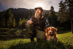
Whether you’re a professional or a hobbyist, printing is an important aspect of photography. Instead of images lost in clouds, hard drives, or social media, printing your photography into wall art or albums makes your photography tangible. Selecting your favorite images for print and laying them out in a story gives them more value and meaning and impact. So why don’t we do it more often? If you’re like many of us, it’s because of the time and work involved in the process as well as the high cost of albums. To help simplify the process for you and to help you create impactful, beautiful albums that are worth the time and effort, here is a step by step guide on how to design a photo album.
In this article, we’ll cover the following steps:
- Decide on an Album Maker and Album Design Software
- Select Your Images and Design Your Spreads
- Retouch and Prepare Your Images for Print
1. Decide on an Album Maker and Album Design Software
The first step in designing a photo album is deciding on the album maker and album design software. Do this before selecting images or creating spreads because each album maker and each design software have different procedures and limitations. So understanding these before you start designing will ensure that you design with their specific workflow in mind.

Album Makers
For album makers, you can either go with consumer albums like Blurb or Shutterfly. For professional albums, we recommend Vision Art, but you have dozens of choices, including Finao, Queensberry, Blacksmith, Graphi Studio, Bay Photo and more.

Album Design Software
Consumer album makers all have their own built in software for designing your spreads, so you will not likely need to sign up or download any other software. For professional albums, you have a few primary options, including Fundy Designer (our recommended software), Smart Albums, Adobe Indesign, or Adobe Photoshop.
2. Select Your Images and Design Your Spreads
If one of the goals for your photography business includes increasing sales of photo albums and wall art, then you’ll need a strong understanding of storytelling and design. In the following video, we have broken down the basics of both skill sets into four simple steps so that you can create albums and wall art that your clients will want to purchase and display in their homes.
Watch the Video Below
The key to designing better photo albums and wall art rests in how you select and organize your photos. Remember these four steps when you select images to design your next album spreads or wall art clusters:
Step 1: Create one story per spread (not a summary)

More often than not, photographers use a number of backdrops or scenes throughout the course of a photo session to capture images of their subjects. Each scene offers a new setting and a potentially new story. In a photo album, a single scene can be further broken down into several small stories and used to fill multiple spreads; it’s important to note, however, that each spread (two pages, side by side) should be treated as an individual story.
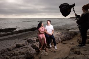
Imagine a photo session took place at the beach, and maybe the couple walked along the beach before standing on the rocks and kissing in front of crashing waves. While it may be tempting to show images representing all of this action on a single spread, we recommend limiting one spread to showcasing the walk along the beach, and another spread to show the couple standing on the rocks and kissing in front of the crashing waves.
Step 2: Select the hero shot to build around

Images on a spread should work well together to tell a story, but there should be a clear hero shot that acts as a centerpiece around which the other images will build. Before you can select a hero shot, you must first understand what you’re looking for.
Take the time to learn more about the types of photos your client wants; it will likely be that favorite image that the couple asked for before the session or pinned a similar image on their moodboard. The hero shot is one that likely encapsulates the mood and feel of the story and showcases the subjects within the scene.
Step 3: Add Images that Contribute to The Story

Once the hero shot has been selected, each additional image should build around the hero shot to reveal more aspects of the story unfolding in that scene (or in this case, across the spread). Simply put, try to use a variety of focal lengths when choosing these images (close-up, medium angle, or wide angle). This also goes back to step one and limiting the selection of images to those that represent the same time and space as the hero shot. If you photographed a family session, for example, your goal when designing an album spread should not be to include an image from each scene you captured during the session. Instead, choose cohesive images from within a single scene to tell a complete story in a single spread (or wall art cluster).
Step 4: Ensure Images are Cohesive in Look and Colors

Unless you’re trying to juxtapose images that don’t go together for effect, we recommend selecting images that are cohesive in look and color. In other words, on a single spread, decide whether the images are going to look light and airy, or perhaps dark and dramatic. Placing light and airy images on the same spread as an image that features dramatic flash may isolate the sets of images and disrupt the story. There’s too much of a jump lighting wise between how each image looks.
Additional Design Tips and Reminders
Less is More
“Less is more” applies to many things in life, and it certainly holds true for album design as well. The usual trap goes something like this: You have these 5 gorgeous images of your bride and groom that you’re proud of. Which ones to put into the portraits spread? Oh, let’s put them all in. Wrong! Your indecisiveness will yield a layout that is crowded, and does not allow for any particular image to “sing” – thereby reducing the impact of all the images. A good general rule of thumb to follow: the more proud you are of an image, the fewer other images should be alongside it.
Negative is Positive
Photography is an art, and so is page layout. Too often, photographers look at a blank spread and feel that they need to fill every empty space with images. Or, they believe that everything must be symmetrical in order to look “good”. But, when done properly, blank (negative) space adds to a diverse layout, and asymmetry in design creates visual tension that helps move the viewers eyes.
Consider Landscape Orientation
Having designed a few (thousand) albums, we have developed a propensity for horizontal (landscape) albums. The reasons are twofold: First, a horizontal album, when opened, yields a very wide panoramic spread that naturally allows your eyes to flow from the left to right in a story telling manner. Compare this to a vertical album, where sometimes images are placed above each other, your eyes would need to shift from top to bottom, and then top to bottom again for the next page. (see diagrams below) Secondly, a horizontal album allows horizontal images to fit in very well, and not surprisingly, most wedding images are shot in a horizontal orientation. That’s because weddings naturally yield more horizontal images: ceremony and reception venue shots, bridal party / group shots, etc. A vertical album can accommodate a vertical image well, but will have trouble with horizontal images.
Horizontal Album

Vertical Album

Designer Across the Gutter
Too many times, photographers view the center gutter of a spread as a tripwire between the left and right sides of a layout. They steer photos clear away from the gutter, and as a result, every spread inadvertently looks to have a distinctive left and right side. There is nothing wrong with this, but the layout becomes boring after a few pages. While we definitely agree that placing major body parts on a gutter is a definite no-no, it is okay to have images cross over the gutter if no body parts are involved – this allows for interesting full or 3/4 panoramas to be used. The overall goal here is that as your clients flip through each spread, they should see a diverse selection of layouts.
3. Retouch and Prepare Your Images for Print

After you’ve designed your spreads, consider taking your images back into Lightroom or Photoshop for further retouch. The larger your image, the more detailed you’ll have to be. Also, ensure each image on the spread has the same general tones and colors. We’ve actually created a detailed guide on preparing your images for print, so be sure to review all of those steps as well.
Bonus Tip – Shoot for the Album
The concept of “shooting for the album” is nothing new, but we feel it’s worth reviewing. The idea here is that certain types of images will naturally assimilate better into a layout. Extra-wide angle shots are one particular example – when used in full panoramic spreads, it conveys the awe and grandeur of the image to the viewer. Used as a background, it helps to frame other images while establishing a setting for the story. Other types of “album-inclined” images include textures and patterns (for use in backgrounds), composition with negative spaces (for small images to be placed atop), and images with solid color backgrounds (so that the page background can be matched). So, at the next wedding, don’t just shoot….shoot for the album!
Conclusion
Printing your images into wall art or albums can feel like a daunting task, but the final reward is well worth the effort. For more information on printing and photographing for the story, we designed the S3: Shooting Stories That Sell Workshop to help photographers increase revenue with wall art and album sales. Upgrade to SLRL Premium now to enjoy full streaming access to this workshop and many others in our extensive library!