Compositional Therories
Composition is what guides our eyes through a photograph and gives importance to the subject in relation to the rest of the photo. Composition through flow, direction, and visual balance, helps drive the story behind your image and grabs your viewer’s attention. It is one of the most important components of photography, or any visual art for that matter, and can turn an ordinary scene to something special.
And unlike many other photographic principles such as focus or exposure that have benefited from technological advancement, each photograph still requires you to personally decide on the overall composition.
The Rule of Thirds
When starting out, it is natural to place your subject at the center of the frame. However, in a photograph having your subject placed dead center often leads to a boring composition. Doing so, makes our photographs look predictable.
The Rule of Thirds is one of the most popular compositional techniques. The Rule of Thirds divides your scene into a 3×3 grid with equal size rectangles. To follow this rule, compose your subject in one third of the frame or on the line. This creates a more dynamic and pleasing composition since it gives more emphasis to your subject and their environment. In regards to the photo below, our eyes go immediately to the children who are the primary subjects of the photograph.
Also be aware of the direction that your subject is looking or moving towards. Generally, it is better for them to look or move into the frame.

The same holds true when you’re taking a landscape photo; it’s more interesting to put either the landscape or sky in two thirds of the frame to give it more importance. Placing the horizon in the middle of the frame makes for an uninteresting composition where neither the sky nor landscape is emphasized.
Using the Rule of Thirds provides balance to the photograph by using the two thirds section of the frame to compliment the one thirds section of the frame where the subject is placed.
Symmetry
Symmetry is defined as the quality of being made up of exactly similar parts facing each other or around an axis. Both sides of the photo look the same. Symmetry works because it creates a feeling of balance and harmony. Look for opportunities to create symmetry in your images with architectural elements (like buildings, windows or doors), lighting techniques, shadows, or placement of your subjects.
Leading Lines
Leading lines are diagonal lines that naturally exist in a scene which help the viewer’s eyes move from one direction to another. The lines are created from converging perspectives as seen through the camera. They should be framed in a way that draws the viewers eyes towards the primary subject as they can draw your eyes away from the subject when used improperly.

Negative Space
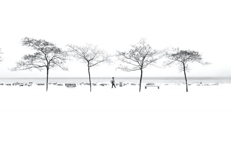
Negative space compositions reduce clutter, i.e. pretty much anything in the photograph that takes your attention away from your primary subject. This can be anything from a Styrofoam cup, a busy tree branch, or any busy details on a focused background that doesn’t help enhance the scene.
This of course doesn’t mean that you can nor should you only shoot against a plain background. The first image of the couple in the bamboo forest works well because the repeating lines are relatively uniform in direction. Were they not, then it would lead to a busy and cluttered background.
Shallow depth of field is another great way to reduce clutter and give visual weight to your subject.
Triangles and Geometry
Looking for geometric shapes in your scene or creating them with your subjects, can make your images very pleasing to the eye. Look at your favorite images and try to decipher why you like them. You’ll likely find triangles in the composition. Can you see the triangle in the composition in my image above? I like to look for other geometric shapes as well; squares, circles, ovals, rectangles. The human eye looks for shapes. Our eyes are drawn to order, and shapes are a way we visually organize information to separate the important stuff from the chaos.
Contrasting Colors
Another way to make your subject stand out is by using contrasting colors. Examples of this include vibrant vs muted colors, warm vs cool colors, and dark vs light colors. The last one, light and dark, is especially important because our eyes tend to move from darker colors towards lighter colors.

Creative Framing (Frame within a Frame)
Framing your subjects is a great way to isolate your subject is to use framing. This can be done with either defocused foreground objects or solid color shape elements. Just make sure that what you are using to frame is not so overly busy that it fights for attention.


Asymmetry
The opposite of symmetry, asymmetry is an interesting way to bring balance to a composition without having everything be the same on both sides. How is it possible to achieve balance in an image with asymmetry? I always try to keep in mind the concept of visual weight. While symmetry achieves balance through uniformity, asymmetrical balance is achieved with different elements that have equal visual weight. Visual weight in photographs is influenced by a variety of factors. I’ll share a few in an upcoming article. Stay tuned!
Parallel Lines
There are parallel lines everywhere you look in a scene. They are created by walls, buildings, trees, the horizon, etc. By lining them up with the edge of the viewfinder frame, you’ll be creating a nice sense of harmony and balance in your image, without causing a distraction from your subject.
If you tilt the frame though, creating diagonal lines, the opposite happens. Imbalance and a sense of falling off the page can happen when diagonal lines are present in your image. Diagonal lines can also add energy and dynamics to a photo if used the right way. Stay tuned for more on that next week (wink, wink).
Repetition
Repetition is something I’m always looking to add to my images. Our eyes look for patterns, which help us make sense of chaos. Repeating patterns are very pleasing to the eye. One of the best places to find repetition is in architecture, so use them to your advantage. Windows, pillars, doors, etc.
Repetitive elements don’t have to be symmetrical. Here’s a variation on the first image above, still utilizing the repeating windows but slightly off center. It still works!
Odd numbers of repeating elements are generally thought to be the most pleasing, but I break this rule all the time. Two, four or six repeating elements can work, too.
Conclusion
These composition guidelines are not set-in-stone rules, but by knowing them, you will have a better understanding on what makes a photo compelling and also when breaking away from standard composition rules can work for you.
Related Articles to Composition Definition

5 Tips on Shooting Sharp Images with a Wide-Open Aperture

Black and White Landscape Photos and Tips to Inspire Your Adventures

Natural Light Portrait Tips | Use Hard Light to Shape the Body

Learn How to Photograph Lightning with These 7 Essential Tips

How to Level Up Your Action Photography

10 Tips for Better Water Reflection Photography

How to Get Creative with Perspective

Defining Leading Lines in Photography (with 20+ Examples!)

7 Principles of Design in Photography

10 Characteristics of a Good Photo

5 Mountain Landscape Photography Tips for Stunning Results


