After the exposure triangle, (Shutter Speed, Aperture, and ISO) a photographer’s choice of White Balance is arguably the fourth most important camera setting that must be decided. White Balance significantly influences the look of any image, by setting a “neutral” (or white) point from which all colors are determined. In this article, we’ll teach you how to use white balance both correctively, so that your images isn’t too warm (orange) or blue (cold), and creatively, when you want to create and image with tones different than what the human eye is seeing.
This article was originally written in 2010 and updated for 2022 with better tips and image examples.
1) Realize Your Limitations of RAW Processing
As we mentioned in our RAW vs JPEG article, shooting in RAW allows you full control over white balance when editing your photos. However, shooting in RAW is not the absolute white balance fix. First and most importantly, there may be situations where you have mixed lighting, e.g. flash in tungsten rooms, window light in fluorescent rooms, etc; Understanding white balance and color temperatures will help you mitigate (or accentuate) the effects of the mixed lighting to suit your desired results.
Secondly, the more color correction you need in post processing, the longer your work flow becomes. And lastly, if your client wants to see the results on the back of the camera (chimping), you want your image looking as good as it possibly can.
2) Find The White Balance Settings
 Without memorizing any definitions or complex concepts, let’s start off with understanding what we have to work with. Our cameras are pretty smart these days, but AWB (Auto White Balance) isn’t always going to yield your desired results. In general, AWB does a good job guessing temperatures in daylight. However, at night time or when shooting indoors, you are going to want to manually set your white balance. Every Camera is a little different, but in general you’ll find the white balance settings somewhere in basic options of the Menu. The image on the left is a visual representation of the white balance settings on a Canon 50D.
3) Memorize The Icons
![]() In its most basic sense, match the icon with your current lighting situation. Most of the icons are pretty self-explanatory, with the sun obviously representing sunlight and the bolt of light representing flash. With such useful icons, many photographers end their white balance learning there. But let’s look again.
In its most basic sense, match the icon with your current lighting situation. Most of the icons are pretty self-explanatory, with the sun obviously representing sunlight and the bolt of light representing flash. With such useful icons, many photographers end their white balance learning there. But let’s look again.
What’s the weird icon with a square the two triangles, what’s that weird rectangle that seems to be glowing, and what’s K 5200? It’s important to memorize the chart on the left. Note that selecting custom white balance requires a subsequent step of selecting an image displaying a white (or neutral) color. This is not the focus of this article, but you can find plenty of video and written tutorials on setting your custom white balance. Also note that K is not mentioned in the chart on the left. The K stands for Kelvin, the unit of measurement for the temperature (or color) of light. We’ll talk more about this the next step. For now, here is a brief explanation of each icon:
- Auto – In this mode, your camera will calculate what is considered the correct color temperature based on what it sees.
- Daylight – Use this mode when you are shooting in under the midday sun during a clear sunny day.
- Cloudy – A cloudy day produces a slightly cooler color than typical sunlight, so the Cloudy WB warms up the tone. This WB is also a good way to add a bit of warmth to your image or to emulate a late afternoon sun.
- Shade – Just like a cloudy day, a shady area cools the colors in the environment, so the Shade WB settings will add back the warmth
- Tungsten – Use this mode when your primary lighting source is your standard incandescent light bulb. This light source is pretty warm, so the WB setting will cool down your colors.
- Fluorescent – When you are shooting under fluorescent lighting, use this WB to warm up the color slightly and correct the greenish hue caused by this type of lighting. Because nowadays there are several variations of fluorescent lights, including a daylight-adjusted version, some cameras have several fluorescent WB options to compensate for those variations.
- Flash – When you are using a speedlight to fill in area, use this mode to warm up the flash a bit. Just remember to not use this mode for large strobes because they are usually daylight balanced already.
4) Master K (Kelvin)
 The K setting in your white balance settings is arguably the most important white balance setting to understand, as you’ll have a hard time using Gels and correcting mixed lighting without understanding kelvins. Try scrolling over the “K” setting, as you see in the image on the left, and scrolling all the way down to 2500K. If you take a picture, your image is likely blueish (the degree of blue depending on your current lighting situation). Now scroll to the opposite end to the 10,000K and take a picture. Your image is likely orange. In the simplest terms, the more you increase the K, the more orange the image becomes; and the more you decrease the K, the more blue the image becomes. The advantage of using the K option, as opposed to the other icons, is that you can check your images and adjust accordingly, instead of settling for a preset.
5) Understand Light Temperatures/Colors
 Everything seems pretty straight forward so far right? Well now it’s important to check out the chart on the left. In the chart, you will see that the lower the Kelvin the more orange the color of the light, conversely, the higher the Kelvin the more blue the color of the light. So what exactly does this mean? Well, this means that if we are shooting in a Tungsten (3000K) lit room, setting our cameras to 3000K will result in the light being “neutral” or white. If we go down from there to say 2500K, the light will turn more blue and hence we would be “cooling off” the image, and if we go up, say to 3500K, the light will turn more yellow/orange and hence we would be “warming up” the image.
When you hear someone say, “I prefer to produce my pictures slightly on the warmer side” or perhaps “slightly on the cooler side.” That isn’t a reference to the actual temperature of the color, but rather it is a reference to how the white balance is set in relation to the temperature of the light in the scene. For example, the person that prefers slightly warmer images would post produce a Tungsten (3000K) image to have a white balance of 3300K. Thus, the overall color would be more yellow and warmer. To make daylight sun (5500K) look warm, that same person would post produce it with a white balance of perhaps 5700K or some amount above 5500K where the light is neutral and white.
Conversely, if someone prefers their images “cooler” they would do the opposite. If the light in the image was Tungsten (3000K) or Daylight (5500K) they would post produce with a white balance of 2800K or 5300K respectively. Any temperature setting lower than the color temperature of the light in a scene, will yield a more blue or “cooler” image. Let’s recap with the following chart:
| Light Source | |
|---|---|
| 1700-2000K | Candlelight |
| 2500-3500K | Tungsten Bulb |
| 3000-4000K | Sunrise/Sunset |
| 4000-5000K | Fluorescent Lamps |
| 5000-5600K | Electronic Flash |
| 5500-6500K | Daylight (Clear Sky) |
| 6500-8000K | Daylight (Light to Medium Overcast) |
| 9000-10000K | Shade or Heavy Overcast Daylight |
5) Memorize Common Kelvins
At this point, it’s beneficial to get back into practical application. So you walk into a hotel ballroom, and notice that the lights are tungsten(ish). Try setting your K low, somewhere between 2500 and 3500 (depending on your preference for warmth or coolness). What do you do if the picture is too orange? At this point, you should know how to troubleshoot this issue by going into your settings and decreasing the kelvins. If it’s too blue, try going the opposite direction. What if you go back outside to sunlight or if you’re using flash (which is approximately the same as sunlight)? Go up to around 5000 to 5500K and fiddle around until you’re happy. The 3000 range and the 5000 range are probably the two most common ranges you’ll experience and therefore worth memorizing.
6) Understand Corrective vs Creative White Balance
As you have hopefully already thought to yourself, in photography there is always room to bend the rules when it comes to the “correct” way to do something. Creatively speaking, there is no “perfect” way to set your White Balance.
Having said that, there is indeed such a thing as ACCURATE White Balance. Colors that appear to correctly represent what the human eye thinks it is seeing. In the above animation, you can see it very clearly: the “warm” image appears overly warm, the skin tones appear unnatural and the whole image has an orange-yellow color. Meanwhile, the correct, more neutral image shows some blue colors in the background, and other neutral (relatively grey/white) color temperatures throughout the rest of the image, …yet the skin tones of the dancers do still appear to have a warm color. Thus, the bluer image could be considered “perfect”.
But, creatively speaking? It’s totally up to you, the artist. It’s probably best to find your own middle ground somewhere in between these two extremes… Personally? I like to go to “neutral”, and then warm up the scene by just 200-400 Kelvin on the WB temperature slider in Lightroom. Your personal preference and style may vary!
 Sony RX10 mk2 | “Neutral” White Balance, ~5000K
Shadowy areas appear blue, sunset-lit areas appear orange
In short- on the one hand, yes there is such a thing as “correct” White Balance, and yet, on the other hand, things are subjective from a creative standpoint.
Creative Warm White Balance

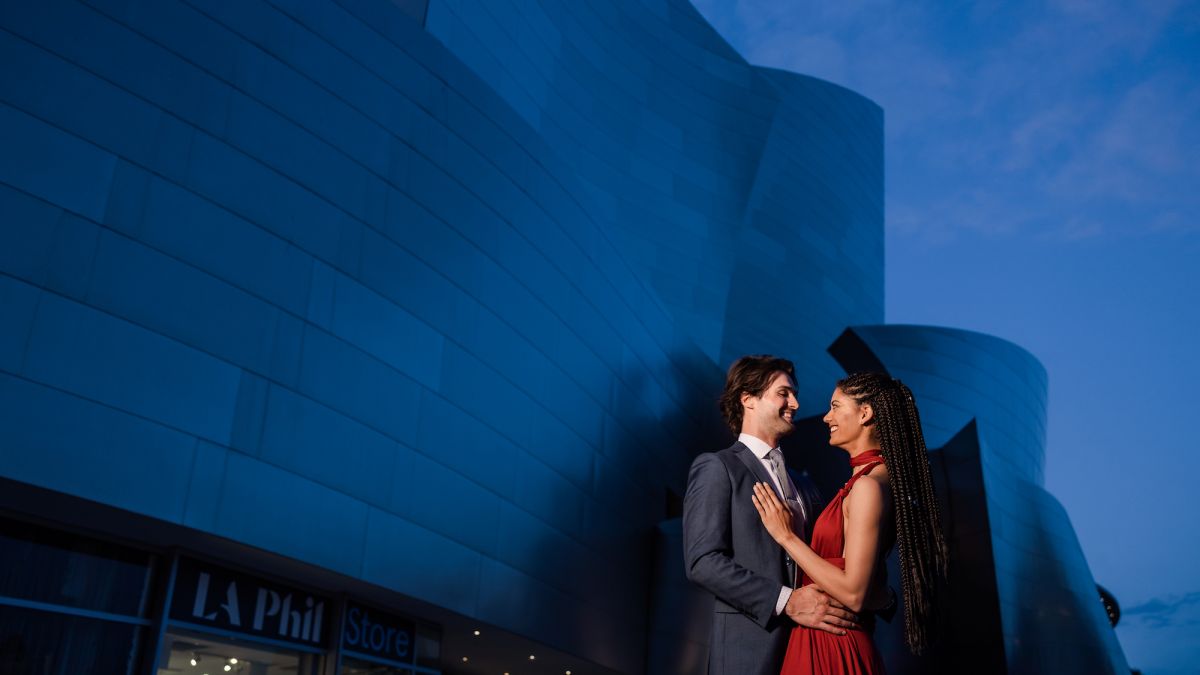
Warm sunlit portraits are one of the sure-fire opportunities for intentionally leaving all the tones in an image a very warm hue. Why? Because the scene begs it, of course! When you think of warm, “golden hour” light, you simply don’t usually want to see perfectly neutral, “correct” tones. You want to see warmth! For the best results, leave your camera in daylight WB, or Cloudy/Shade for even more warmth. Or, of course, 5000-7000 Kelvin WB.
Creative Cool White Balance
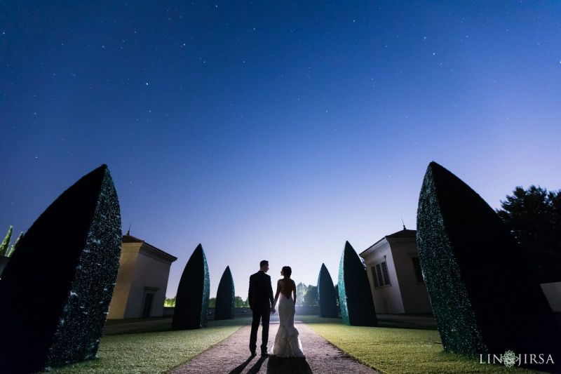
Oppositely, cool tones can be just as beautiful, as long as you set the scene to match it! In the above image, since stars are visible in the night sky, a cooler image seems to lend itself more to the moment, and a more elegant pose works in portraiture. For the best results, set your camera to fluorescent WB, or, better yet, 3000-3000 Kelvin WB.
7) Troubleshoot Mixed Lighting
So why does all of this matter? Shouldn’t AWB take care of it all? As we mentioned, often times AWB will get it right, particularly in simple situations like in daylight. But you’re going to run into issues when you have mixed lighting in the scene. When your flash is turned on, AWB automatically goes to the Flash white balance setting (5500K). In a tungsten setting, this makes already yellow Tungsten lighting become a muddy orange. For the sake of learning, let’s rehash why this is the case. Your camera setting is around 5500K, which makes your flash lighting white. This is great for your subjects, but remember that in order for your yellow/orange tungsten backgrounds to be white, your camera settings need to be lower around the 3000K range. So, since the flash is at approximately 5500K while your background is at around 3000K, post producing the flash to look correct will cause your backgrounds to be 2500K too high, and thus unnaturally orange. While on the other hand, post producing the scene to match your background Tungsten light of 3000K will result in your 5500K flash coming out completely blue, giving you smurfs for subjects. So now instead of wondering why your images are producing strange colors, you should now be able to troubleshoot and decide for yourself what effect you want.
8) Understand How Flash Gels Affect an Image
The next step in learning white balance and color matching can be learned by picking up a set of Gels for your flash. We’ll get further into Gels in a later tutorial that branches off of the understanding you gained from this article, but we wanted to give you a brief example of what gels can do for your photography. Basically if you stick a gel over your flash that matches the color of lighting in the background, then set your K accordingly, you can effectively match the light in the foreground and background. In the picture below, notice the clean and consistent lighting from the subjects to the background from a gelled flash inside of a tungsten(ish) lit room. As I mentioned, we’ll get into this in another article, but this should give you a quick introduction to the subject matter; and furthermore, you should have a decent idea of the white balance concepts at play in the image.

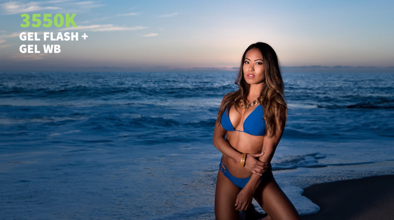
In the second example, we’re shooting during sunset on the beach, and my test shot is at 4500K with no flash. As soon as I took the shot with a gelled flash, I realized that I wanted the blue background and the model’s blue bikini to pop and be a stronger color in the image.

So I added a Gel on my flash and had my assistant stand to camera left with a silver reflector so I could bounce off of it. I also dialed down my Color Temperature to 3500K to allow the blue in the scene to become more dominant. Creatively modifying Color Temperature is a fantastic way to add extra dimension and interest into your images.
Conclusion and More Information
If you’re interested in learning more about white balance and all of the other fundamentals of photography, check out our Photography 101 Workshop in SLR Lounge Premium.


Get Connected!