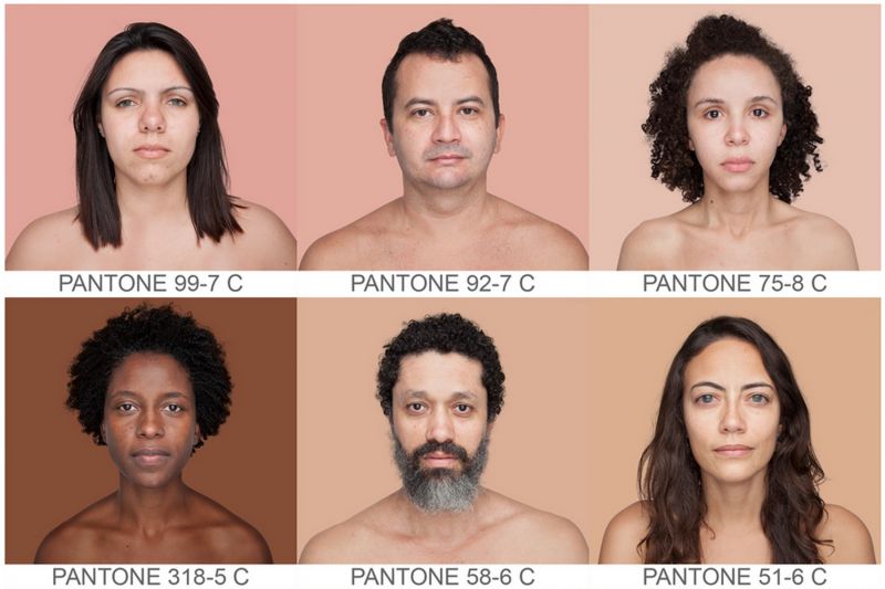

Color. In photography and design, as well as in our cultures, politics, societies and prejudices, color is a powerful element. Educated creatives carefully choose colors to communicate certain emotions, intentions and focal points. We define entire decades based on popular colors of the day. Specific colors compel us to eat, sleep, spend money or fall in love. We must use color wisely…
Unless you’re a creative who has been living under a rock, you know the Pantone Color Matching (PMS) System is the standard in any creative industry for choosing and producing accurate color, and it has even become a household name in recent years with their “color of the year” campaign. Not to mention partnerships with other brands to create consumer products, like a make-up line for Sephora, and a plethora of licensed products like mugs and coasters.
Brazilian photographer, Angélica Dass, has taken it upon herself to categorize the skin tones of the entire human race, based on the Pantone Color Matching System. Her intention for the on-going work-in-progess entitled Humanæ, in a nutshell, is to reveal that everyone’s skin is, in fact, different. There are as many skin tones, even within the same race, as there are in my giant platinum PMS swatch brief case. She has taken more than a thousand portraits of people from all over the world, showing that labels such as red, white, brown and yellow are pretty inaccurate ways to define human skin.


From the artists statement:
Those who pose for the project are volunteers. There is no previous selection of participants and there are no classifications relating to nationality, gender, age, race, social class or religion. Nor is there an explicit intention to finish it on a specific date. It is open in all senses and it will include all those who want to be part of this colossal global mosaic. The only limit would be reached by completing all of the world’s population.
The process followed by Dass to achieve the appropriate PMS color for each subject, is rigorous and systematic: the background for each portrait is tinted with a color tone identical to a sample of 11 x 11 pixels taken from the face of the photographed.
While the ultimate purpose behind the project seems ambivalent, or organic, the artist’s hope to break down racial barriers or, at the very least, get a discussion going, is evident. She states:
Many of the ingredients that characterize the [best] spirit of this time appear to be part of this project: shared authorship, active solidarity and local proposals likely to operate globally, networking, communication expanded to alternative spaces of debate, awareness without political ideology, social horizontality…
If you understand Spanish, you’ll be able to gain greater insight into the project by watching Angelica’s TEDx talk. She gets a little emotional while explaining her inspiration and motivation for taking on such a personal project. She brings up the fact that, like the multitude of colors available in a Pantone book, no human skin color is more or less important than another. She also notes that even an individual’s skin tones changes throughout their life time, depending on age or how much time one has spent in or out of the sun.
From an art director’s stand point, I’m seeing this project from an entirely different view point. It would be very convenient to be able to specify a model I want for a certain campaign based on skin tone Pantone color. Or, are all skin tones considered to be neutral? Maybe this will lead to a new standard in model specifications? Perhaps another licensing opportunity for Pantone?
Personally, this might also be very helpful when selecting make-up and buying clothing or accessories online. Seriously. Just carry your little personal skin-tone Pantone swatch in your purse for use in selecting a complimentary shade.
(In case you missed it last week, check out my article about Fashionable DIY Photography Accessories by clicking here.)
Ok, maybe I’m making light of a very thought provoking subject. What do you think of the project? I’ve never really liked the categories we create based on skin tone. Those little boxes you can “optionally” check when filling out college applications always made me feel a little uncomfortable. I’m a person. Why do you need to know my skin color? That being said, I wonder what Pantone color my skin tone would be? When you look at a mosaic of the thousands of photos Dass has collected, you realize no human’s skin is, in fact, black, white, red or yellow.
Follow the Humanæ project on Tumbler.
P.S. If you’re struggling to achieve buttery smooth skin tones and textures in your portraiture, check out the SLR Lounge Lightroom Preset System. It will literally change your life (it changed mine, anyway!)
CREDITS: Photographs by Angelica Dass are copyrighted and have been used with permission for SLR Lounge. Do not copy, modify or re-post this article or images without express permission from SLR Lounge and the artist.


Get Connected!