Can every location be defined by a unique, identifiable color palette? Adobe Photoshop and Lightroom Evangelist and photographer Julieanne Kost set out to answer that question with her project, “Color of Place.”
A series of images created from blurred strips of travel photographs, this body of work reveals the color palettes of 25 locations around the globe as Julieanne sees them—from Joshua Tree to Kyoto, Antarctica to Berlin—while exploring the psychology of color in the process.

“Every time you take a memory out and play with it, it changes a little bit.”
Assembling the Pieces
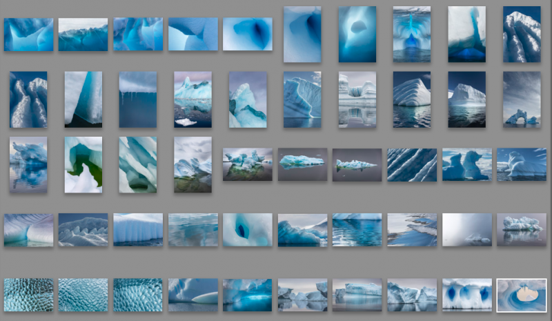
Julieanne begins the process by selecting 50 of her favorite images from a given location, noting that she tries “to find the photos which best represent the colors of a specific location.” Based on her experience of the location during the shoot, Julieanne curates the photos in Lightroom to create the color palette closest to her in-person experience. In Photoshop, Julieanne then applies the Path Blur filter to the photographs and selects a small strip of each image. She arranges these to form her 50×20 canvas.

“My initial intent was to arrange the strips left to right across the canvas in the order in which they were captured,” Julieanne admits, “but that didn’t always lead to aesthetically pleasing images.”
Taking artistic license, she rearranges the strips until they ring true for each location. However, this adds another layer of complexity because the number of ways to rearrange 50 strips is 50 factorial (approximately 3 followed by 64 zeros).
[REWIND: Photographer Takes “High-Fashion” Hiker Portraits Along The Pacific Crest Trail]
Nevertheless, Julieanne wanted to do each location justice. “In order to try several different arrangements,” she tells us, “I import the 50 strips into a collection in Lightroom and reorder them using Survey view.” When she has the order just right, Julieanne explains, “I then export the strips, adding a numerical sequence at the beginning of the file name in order to maintain the order when placed into the Photoshop document.”
If the success of the project were based on objectivity, then it might have missed the mark. According to Julieanne, however, the project focuses more on representing a personal experience rather than capturing an objective truth:
Note: While I found that I was able to create a unique color palette for every location specific to the time of my visit, the color palette that I chose to represent that location was far from being objective. First, there were obvious external factors that would bias the color palette such as the locations that I chose to visit, the time of day that I photographed, and the season/weather conditions. Then, there were personal biases such as what subjects I choose to photograph and, what subjects I deliberately avoided. And, there were additional, subjective biases when it came to selecting my “favorite” fifty images, compounded by the discretionary selection of a portion the original, distorted again by the order in which they were arranged. So, while I found it impossible to create a truly objective color palette, I was able to create an image based on how I experienced the location.
What do you think about the project? Does this make you want to go back to your travel images and see how your color palettes stack up when edited and assembled in a similar fashion? Let us know in the comments below.
SLRLounge LIGHTROOM TUTORIALS
Browse our industry-leading Lightroom education. Whether you’re just getting started and need to learn Lightroom basics or you’re a seasoned pro looking for advanced Lightroom techniques, we have the right workshops for you.
SEE LIGHTROOM WORKSHOPS


Get Connected!