Made from Adobe’s ever-expanding knowledge base gleaned from basically every creative industry, Creative Cloud contains many, many, useful features you may not have heard of or tried yet. One little gem that has eluded many is Color (formerly Kuler.) Color lets you create color palettes in a few different ways. If your color theory is shaky, Color will provide the knowledge for you by letting you select a color rule and a hue, then creating a palette of five colors for you based on the color rule you select.
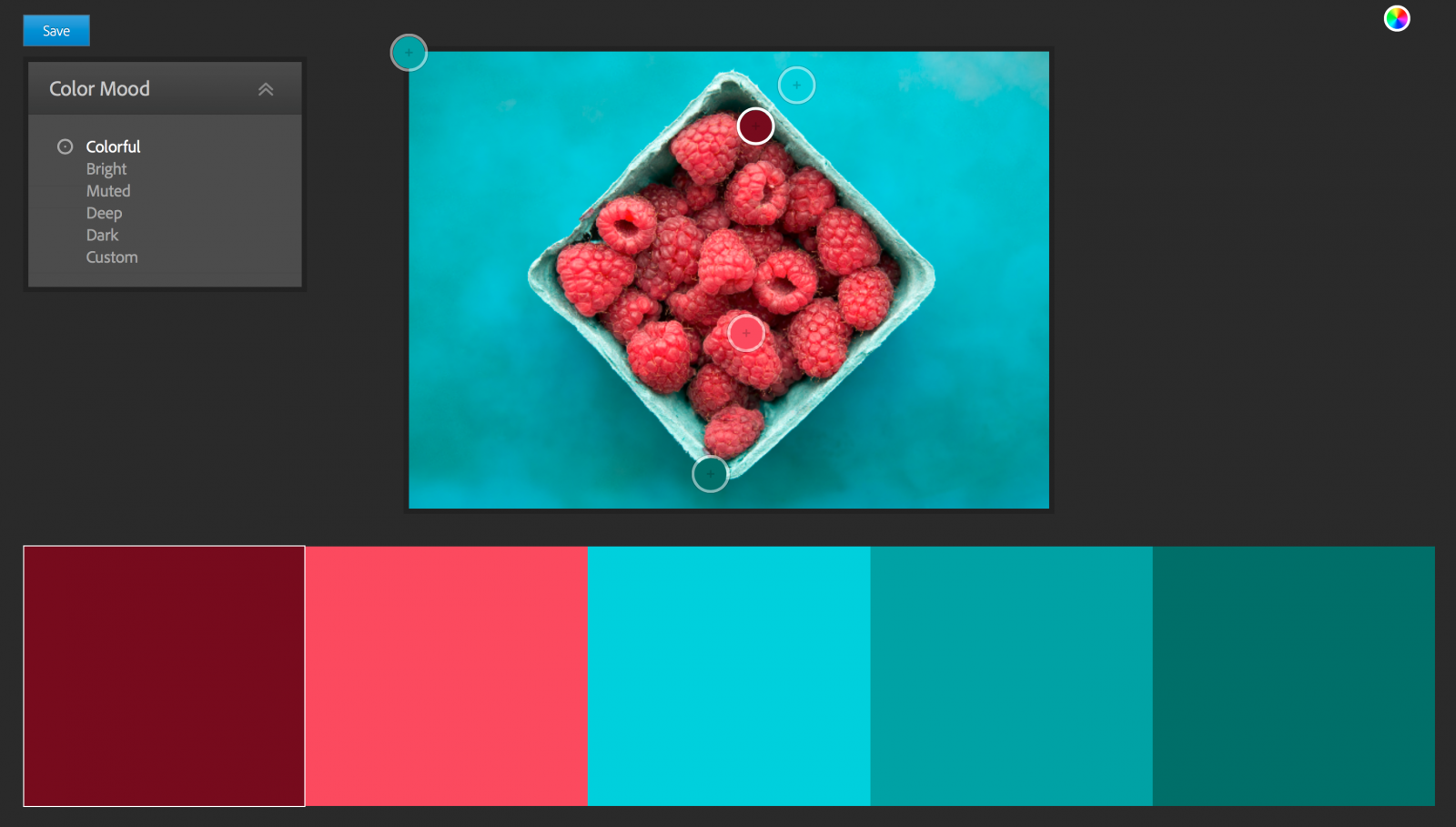
You can also upload photos to Color and generate palettes, called ‘themes’, based on a mood you choose from a drop-down menu. All the ways to create themes are customizable whether you’d just like to make a slight adjustment from what Adobe chose or make something that’s completely of your own creation.
For making themes out of things you find as you live your life, there’s the AdobeCapture CC app, which has integrated a few Adobe asset-creation apps, including the old Color app, into one. Just use your phone’s camera to take a photograph and AdobeCapture will show the colors it will add to the theme in real time, which of course can be adjusted as needed. You can also do this with photos you already have on your phone.
These themes can be used for various purposes across Adobe programs, but we’ll touch on Photoshop integration here. Color themes can be found in the Photoshop CC under Window > Extensions > Adobe Color Themes. From there, anything that you’d use a color for in Photoshop now has an option to work with one of your themes or one of many pre-existing themes that are available.
Possibly one of the best use of color themes in Photoshop is color-grading images. You can load the colors in your theme into your swatches from the extension window and sample them to assign to a gradient map which can then be played with until the best blend mode and opacity combination is discovered.
A quick example using the color theme created in AdobeCapture CC pictured below:
Open the Adobe Color Theme extension, and if you want to use one of your own themes, choose the “My Themes” tab. If you want to use a pre-made theme, you want the “Explore” tab. Click the three dots under the theme and choose “add to swatches.” I’ve already done this, and you can see the theme colors at the bottom of the swatches.

Make a gradient map adjustment layer and double click it. Click the gradient that comes up by default to navigate to the gradient editor seen above. Click under the gradient bar to add boxes for colors. There are only two when you open it with one at each end. Then click the box on the far left underneath the bar, use the eyedropper on the darkest shade in your swatches from the theme, and make your way to the right doing the same and moving through the swatches until you get to the end. Hit “OK” and reveal your masterpiece.
Subtle, right?
Ok – this is where you play with it until you get something you like. I went with “soft light” for the blend mode at 16% opacity.

[RELATED: Intro To Color Theory & Practical Tips | A True Divisor Between The Pro & Amateur]
Top is “before,” bottom is “after” with the gradient lent from a summer sunset adding some warmth. Give it a try, it’s pretty fun stuff.


