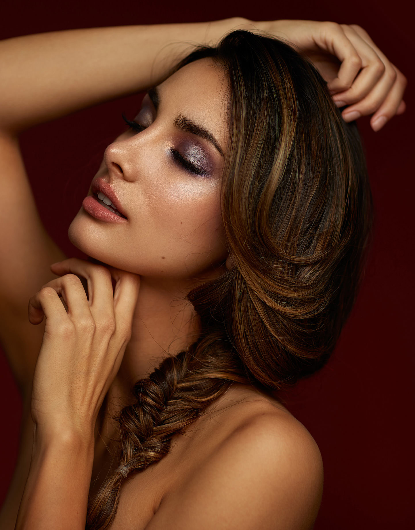
I love implementing color in my work. When starting photography, color was the main reason I got into using strobes on location and building my commercial and advertising style. I remember my first time shooting portraits with a DSLR, looking at the washed out sky, and immediately thinking “How do I make this as blue as it is to my eyes?“
And that love for color transitioned into my studio work, opting for bold colored backgrounds instead of your mundane grays and whites. So when the new year came last year, and I decided I was going to market myself as a beauty photographer, my love for color was the basis for the new work I was planning. And so I immediately went out and bought a whole bunch of colored seamless paper rolls.
I can still recall the look on the camera shop employee’s face when I had my short list of bold colors, tucked behind their shelves of whites, grays, and blacks…which easily outsell all of the other colors.
Using Colored Seamless Paper for Studio Photography: At a Glance
This guide covers how to get the most out of colored seamless paper backgrounds in your studio, from lighting techniques to color theory and practical backdrop choices.
- How to Properly Shoot on Colored Seamless – Lighting techniques for tonal control over your backdrop
- Color Range Examples – See how different power levels change backdrop appearance
- Implementing Color Theory into Your Seamless Choices – Using complementary tones to complete your image
- Matching Seamless Paper to Skin Tones – How to pair backdrops with diverse complexions
- Frequently Asked Questions – Common questions about colored seamless paper
How to Properly Shoot on Colored Seamless
One of the biggest misconceptions I read when it comes to colored seamless is that they’re a one-trick pony. A misunderstanding with colored backdrops is that they only have one tone and can only be used for a single look, but that couldn’t be further from the truth. With how they are lit, you’re able to get an incredibly broad range of colors and tonal properties out of them, but this does require you to have a good understanding of how to properly light the seamless.
Lighting Your Background and Subject Independently
The easiest way to do this is to light your background and subject independently, so that you have full tonal control over the seamless background, without having to adjust the light on the subject. To do this, you want to have a lot of space between your subject and the background, so that light on the background isn’t reflecting back onto your subject and vice versa.
I could bore you by stating the Inverse Square Law, and how intensity is inversely proportional to the square of the distance, but all you need to know is that the space between your subject and background should be at least double the distance that the lights are from their subject. The result is that you have light(s) lighting the background, and light(s) lighting your subject. This separation allows you to get a broad range of colors out of a single roll of seamless, which I’ve demonstrated below, using some of my favorite colors.
If you’re working in a smaller studio, even six to eight feet of separation between your subject and the backdrop can make a noticeable difference. The goal is to reduce spill from your key light reaching the background, and to prevent your background lights from wrapping around onto the subject. Using grids, barn doors, or flags on your lights can help control spill even further when you don’t have the luxury of a large shooting space.
Color Range Examples: What a Single Roll Can Do
To show just how versatile a single roll of colored seamless paper can be, I’ve photographed the same setup using several different Savage backdrop colors, adjusting only the power of the background light from low to high. The difference in tonal range you can achieve from one roll is pretty dramatic.
As you can see in the examples above, the difference between lighting the backdrop at low power and at full power is pretty stark. By isolating your lighting, you’re able to have a broad range of control that helps you match makeup and set pieces, and diversify your work while using the same tools you usually use. A single roll of Flamingo, for instance, can look like a deep rose at low power or a bright bubblegum pink when you crank up the background light. That kind of versatility means you don’t need a closet full of twenty different rolls to create twenty different looks.
Implementing Color Theory into Your Seamless Choices
Perhaps the best technique I use when working with colored seamless is implementing my knowledge of color theory to better complete an image. For those who have limited knowledge of color theory, Adobe has created an incredible tool that allows you to play with colors to help find complementary tones, called Adobe Color. A quick ten minutes using this tool will give you a greater grasp on how colors work with each other, and allow you to use colored seamless more effectively to help complete your image.
Understanding Basic Color Harmonies for Photography
The key color relationships to understand when choosing your seamless backdrop are complementary, analogous, and triadic harmonies. Complementary colors sit opposite each other on the color wheel (think blue and orange, or red and green) and create strong visual contrast that draws the viewer’s eye. Analogous colors sit next to each other on the wheel and produce a more harmonious, unified feel. Triadic colors are evenly spaced around the wheel and offer balanced contrast without being as intense as a straight complementary pairing. When you’re planning a beauty or portrait shoot, think about how the backdrop color will interact with your subject’s wardrobe, makeup, and accessories. A complementary backdrop can make those elements pop, while an analogous one will create a softer, more cohesive mood. Some examples of these techniques are below.
Matching Seamless Paper to Skin Tones
But colored seamless doesn’t mean having to overuse the traditional ‘gold and teal’ techniques used in all art forms; you can also implement these tools to better match your base skin tones with the scene. Without a doubt, one of my favorite colored papers is called Pecan, for how well it works with a broad range of skin tones. From pale complexions to darker complexions, I’m able to use my understanding of lighting to create images that help match skin tones for a large variety of subjects.
The warm, earthy quality of Pecan makes it incredibly forgiving. At lower light levels it reads as a rich chocolate brown, and as you bring up the background light it shifts into a warm tan that flatters just about everyone. This is why neutral-warm tones like Pecan, Mocha, and Cocoa tend to be popular choices among portrait and beauty photographers who work with a diverse range of models. They don’t compete with or clash against skin tones the way some cooler or more saturated backdrops can.
Practical Tips for Working with Colored Seamless Paper
If you’re ready to add colored seamless paper to your studio toolkit, there are a few practical considerations worth keeping in mind beyond just choosing your colors and lighting setup.
Start with Three to Five Versatile Colors
You don’t need to buy every color in the catalog to get started. A good foundation might include one warm neutral (like Pecan or Mocha), one bold primary or secondary (like True Blue, Plum, or Flamingo), and one classic (white or gray). From there, you can build out your collection based on the types of shoots you book most often. Remember that each roll gives you a wide range of tones depending on how you light it, so three rolls can easily produce ten or more distinct looks.
Watch for Color Spill on Your Subject
One thing to be aware of with brightly colored seamless paper is color spill, where light reflecting off the backdrop casts a colored tint onto your subject’s skin, hair, or clothing. This is especially noticeable with saturated colors like red, orange, or deep yellow, and becomes more pronounced when your subject is close to the backdrop. Increasing the distance between subject and background helps, and you can also use negative fill (black v-flats or flags) on the sides of your subject to absorb the reflected color. A little bit of post-processing cleanup in Lightroom or Photoshop can handle minor spill, but prevention is always easier than correction.
Store and Maintain Your Paper Properly
Colored seamless paper should be stored vertically to prevent the core from sagging under the weight of the roll. Keep rolls in a dry area away from direct sunlight, as prolonged UV exposure can fade the color over time. When you’re done with a session, cut off the used portion and roll the remaining paper back tightly. A few spring clamps will keep the roll from unraveling in storage. Taking care of your paper means it will look fresh and consistent shoot after shoot.
Frequently Asked Questions About Colored Seamless Paper
How many different looks can you get from one roll of colored seamless paper?
By lighting your background independently from your subject and adjusting the background light power, you can typically achieve five or more distinctly different tonal variations from a single roll. At low power, the paper appears as a darker, more saturated version of its color. At high power, it lightens and desaturates considerably. Combining this with different gels on your background light can expand the range even further.
What is the best seamless paper color for portrait photography?
There’s no single best color since it depends on the mood, wardrobe, and skin tone you’re working with. However, warm neutrals like Savage Pecan (#53) and Mocha (#76) are extremely versatile because they complement a wide range of skin tones without overpowering the subject. For more dramatic looks, deeper colors like Plum (#91) or True Blue (#75) create striking contrast, especially for beauty and editorial work.
How far should my subject be from the colored backdrop?
For full tonal control, aim for at least double the distance between your light and subject as the distance between your subject and the background. In practical terms, six to ten feet of separation works well in most studios. This distance reduces color spill from the background onto your subject and gives you independent control over background brightness and tone.
Do I need separate lights for the background?
While it’s possible to shoot on colored seamless with a single light, using at least one dedicated background light gives you dramatically more control. Without a separate background light, the backdrop’s tone is entirely dictated by how much spill reaches it from your key light, which limits your creative options. Even a simple, affordable strobe or speedlight aimed at the backdrop opens up a much wider range of looks from each roll.
Conclusion
Hopefully, this introduction to colored seamless paper has encouraged you to go out and shoot your next studio session with bolder colors. With a solid understanding of independent lighting control and basic color theory, even a small collection of colored rolls can produce a surprisingly wide variety of looks. If you too have fallen in love with the more eccentric colors offered by manufacturers, be sure to show us your examples in the comments below!


