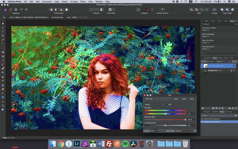
When capturing images, you will find some colors appear more intense than others depending on the situation. Jumping into a powerful program like Lightroom or Photoshop can be a treacherous predicament, especially when you don’t know what every tool does. Breaking down blacks versus shadows, highlights versus whites, and saturation vs vibrance is critical for the best output.
We’ve found two of the best videos that compare vibrance and saturation in regards to Lightroom and Photoshop.
Video 1 – Vibrance vs Saturation (Photoshop Training Channel)
Jesus Ramirez, of the Photoshop Training Channel, produced a quick video showing the difference between the smart-tool that is Vibrance and the crude slider that is Saturation. Toward the end of the video Ramirez explains what is going with the vibrance slider and just how it affects the RGB spectrum. Just like the many brushes at an artists disposal, vibrance is another tool in your photo editing arsenal. It is best used for quick global adjustments, but when a bit more finesse is required the selective color adjustment panel in HSL might be a better option.
Also, while you’re at it, check out our break down of Highlights vs Whites and Blacks vs Shadows, below:
- Highlights vs. Whites | What’s The Difference & When To Use Which?
- Shadows vs. Blacks | What’s The Difference & When To Use Which?
See the Video
Saturation
Saturating the colors in photoshop you may find that that the already vibrant colors begin to posterize when you get the muted colors where you want them to be; nothing can take an image from great to cartoon quicker. Saturation is a uniform increase in the intensity of all colors equally, regardless of how muted the colors are.
Saturation is a uniform increase in the intensity of all colors equally, regardless of how muted the colors are. Over-saturating can result in clipping often producing less than pleasing skin tones.

Vibrance
Because Photoshop has redundant functions that can be used for the same action, vibrance can be used to make the colors of your image pop without clipping. Vibrance is a smart-tool which increases the intensity of the more muted colors, leaving saturated colors alone. Vibrance also prevents skin tones from becoming overly saturated and unnatural.

Video 2 – Vibrance vs Saturation (Evan 5ps)
Atlanta photographer, Evan 5ps exposes the difference between the two and adds a bit of clarity for your benefit.
Saturation v Vibrance
They both strengthen the intensity of the color in your image, however; they both do so differently.
Saturation intensifies all the colors in your images.
Vibrance is more specific and its effect is focused on the mid-tones of an image.
In Lightroom, you can find pairs of sliders that impact an image in a similar fashion: white & highlights, blacks & shadows. It is important to get familiar with why they impact your image differently and then when it is best to deploy each respective adjustment to create your masterpiece. As you advance in your photographic and post-production skill, those little details will become more important to master. Speaking of, if this is the kind of information you’re looking for then the following pieces will be right up your alley:
Conclusion
A great post-production workflow involves a keen eye that locks in on the details of an image. It is those skillful adjustments that give that image a quality which causes viewers to pause and soak in its beauty and creativity. The way to accomplish this is to fully understand how the tools at your disposal impact your photo. However, with so many tools at the tip of your stylus, their unique benefits can become unclear because the effect of different tools can sometimes overlap. We hope this article has helped you gain a better understanding of these seemingly small details that can make a big impact on a final image.


Get Connected!