I’ll analyze both articles and create a unified, comprehensive piece on color correction that combines the conceptual rules from Article 1 with the practical step-by-step tutorial from Article 2.
My approach:
Use Article 1’s “5 Rules” framework as the foundation since it provides strong structural organization
Integrate Article 2’s practical Lightroom tutorial as a new hands-on section
Update outdated references (the step-by-step uses old Lightroom sliders like “Brightness” which is now “Exposure”)
Add the standard enhancements (At a Glance, FAQ, anchor IDs, alt text)
Let me create the combined and enhanced article:
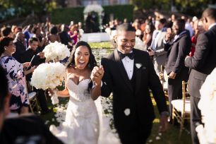
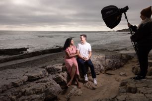
Whether you’re refining skin tones for portraits, adjusting the vibrancy of a landscape, or ensuring your images align with your creative style, color correction is the foundation of professional-grade photo editing. Understanding how to properly color correct your images separates snapshots from polished, print-ready photographs. In this comprehensive guide, we’ll cover the essential rules of color correction that every photographer needs to know, then walk through a practical step-by-step example so you can apply these concepts immediately. While this article focuses on Adobe Lightroom, the same principles apply to all photo editing software.
Keep in mind that post-production is a stylistic subject, and what looks right to some may not appeal to others. This article will teach you color correction fundamentals while giving you the freedom to develop your own aesthetic preferences.
Color Correction in Lightroom: At a Glance
This guide covers everything you need to know about color correction, from setting up your workspace to hands-on editing techniques:
- Rule #1: Calibrate Your Monitor – Why accurate color starts with your display
- Rule #2: Use a Quality Wide Gamut Display – Choosing the right monitor for editing
- Rule #3: Edit in a Semi-Dark Environment – How ambient light affects your perception
- Rule #4: Make Largest Adjustments First – The most efficient editing workflow
- Rule #5: Color Correction is Subjective – Balancing accuracy with creative vision
- Step-by-Step Color Correction Example – Practical tutorial with before and after
- RAW vs. JPG for Color Correction – Why file format matters
- Frequently Asked Questions – Common color correction questions answered
Watch the Video
Prefer video? Watch our complete walkthrough of these color correction rules below, or continue reading the article for the full written guide with additional examples.
Rule #1: Color Calibrate Your Monitor
The first rule of color correction is making sure your monitor displays colors accurately. Without calibration, you’re essentially editing blind. You might think you’re creating perfectly balanced images, but what you see on screen may look completely different when printed or viewed on other devices. To calibrate properly, you need to buy, rent, or borrow a hardware color calibration device.
For our studio at Lin & Jirsa Photography, we use Datacolor Spyder calibration devices because they work consistently from monitor to monitor and give reliable results across all the different displays we use, from laptops to desktop monitors. Other popular options include the Calibrite ColorChecker series. The investment in a calibration tool pays for itself quickly when you consider how much time you’ll save not second-guessing your edits.
Calibration is Not a One-Time Task
Just because you have calibrated your monitor once does not mean you’re done forever. Over time, monitors tend to become dimmer and colors start to shift as the backlight ages. Set up a calibration reminder to recalibrate your monitor every 30 to 60 days. Most calibration software includes a scheduling feature that will prompt you when it’s time to recalibrate.
What Happens Without Calibration
For those working on uncalibrated machines, you will probably see much cooler (more blue) results on your display, especially on PC monitors. This means when you go to correct an image, you’ll push the colors too far in the wrong direction to compensate for what you’re seeing. When we post images to SLR Lounge, people sometimes comment that the original image looks better than the edited version because they prefer the yellows in the original. However, what they see on their uncalibrated screen looks different from reality, and that image will probably come out much more yellow when printed. Calibrate your monitor if you want to accurately judge colors for yourself or your clients.
Rule #2: Use a High Quality Wide Gamut Display
Using cheap or low-quality displays will hinder your ability to color correct images accurately. Budget monitors often have limited color gamuts, meaning they physically cannot display the full range of colors your camera captures. They may also have poor color accuracy out of the box and inconsistent brightness across the screen.
We recommend sticking with Apple displays, higher-end Dell UltraSharp monitors, Samsung professional displays, BenQ, ASUS ProArt, or EIZO monitors when editing images. These brands offer models specifically designed for photo and video work with wide color gamuts and factory calibration.
What to Look For in an Editing Monitor
When shopping for a monitor, look for displays that cover at least 99% of the sRGB color space, though 100% Adobe RGB coverage is ideal for serious photo work. IPS panel technology generally offers the best color accuracy and viewing angles. Speaking of viewing angles, look for 178-degree viewing angles both horizontally and vertically. Without wide viewing angles, you’ll notice that your monitor displays shadow and highlight brightness very differently depending on where your eyes are positioned relative to the screen.
It’s also a good idea to purchase a display from a retailer that allows returns within a reasonable window. Calibrate a new display immediately, then print out a couple of test images to verify you’re getting accurate results. If the prints don’t match what you see on screen after calibration, you may need to try a different monitor.
Rule #3: Edit Images in a Semi-Dark Environment
Your editing environment affects how you perceive the images on your screen. Specifically, do not work in any area that has light falling directly on your monitor. Glare and reflections make it impossible to accurately judge contrast and color, and you’ll find yourself fighting against the ambient light rather than focusing on your edit.
Why Room Brightness Matters
If you are editing in a very bright room, your images have a tendency to come out too bright. Your editing will compensate for the brightness your eyes perceive all around you, not just on your display. You might not be able to tell how bright those images really are since everything around you is competing for your attention.
On the opposite end, if you are editing images in complete darkness, your images will probably come out too dark because your display is so bright compared to everything else in the room. Your pupils dilate in the dark, making the screen appear brighter than it actually is.
In short, your eyes need to be comfortable and adapted to a consistent environment, or they will throw off your perception. Edit your images in a moderately dim room without any light falling directly on your screen. A bias light (a soft light placed behind your monitor) can help reduce eye strain while maintaining a controlled environment.
Match Your Room Lighting to Your Display
It also helps if the color temperature of the light bulbs in your room roughly matches the color temperature of your display, which is typically around 6500K (daylight). If your room is lit with warm tungsten bulbs while your monitor is calibrated to daylight, the mismatch can subtly influence how you perceive white balance in your images. Daylight-balanced LED bulbs are inexpensive and widely available, making it easy to create a consistent editing environment.
Rule #4: Make Largest Adjustments First
Another important rule of color correction is the order in which you make your adjustments. Always adjust images from the largest corrections down to the smaller refinements, not the other way around. This workflow saves time and produces more predictable results.
Why Order Matters
Let’s say the biggest change you need to make to an image is exposure. If you adjust contrast or saturation first, those adjustments will shift when you finally correct the exposure, and you’ll need to go back and redo them. One very common mistake is for people to simply go down the sliders in order, adjusting white balance before they address exposure. If your image is significantly under or overexposed, this approach wastes time.
When you start with smaller adjustments first, you will end up having to revisit other sliders after making the largest correction. You can wind up going back and forth two or three times before you arrive at your final result. Starting with the biggest problem first means every subsequent adjustment builds on a solid foundation.
Recommended Adjustment Order
A good rule of thumb is to address exposure and white balance first (whichever needs the most correction), then work through the remaining adjustments in Lightroom’s default order from top to bottom. Lightroom’s Develop module has already been designed to follow a logical processing sequence. By following this workflow, you’ll save significant time since you won’t have to repeatedly revisit earlier adjustments.
The general order should be: Exposure and White Balance (largest corrections first), then Contrast, Highlights, Shadows, Whites, Blacks, and finally Presence adjustments like Clarity, Vibrance, and Saturation. Local adjustments and effects like vignettes come last.
Rule #5: Remember that Color Correction is Subjective
The last thing to remember is that color correction is subjective. Sure, there might be technically “wrong” ways to color correct an image (like making skin tones look green), but there are also many different “right” ways to approach the same photograph. It ultimately comes down to style and creative intent.
Sometimes photographers feel there is only one correct way to edit an image, but you can and should make your own artistic decisions. Two photographers might process the same RAW file very differently, with one creating a warm, golden-hour feel by pushing the temperature slider up, while another creates a cool, moody atmosphere by pulling it down. You might also convert an image to black and white entirely. None of these approaches are incorrect because they represent different creative visions.
As an educational resource, our goal is to give you tools to work more efficiently and make informed decisions. While right and wrong may be subjective in terms of style, there is always a faster way to accomplish your editing goals. Master the fundamentals first, then let your personal aesthetic develop naturally.

Step-by-Step Color Correction Example in Lightroom
Now that you understand the rules, let’s walk through a practical color correction example from start to finish. This will show you how to apply these concepts to a real image using Lightroom’s Develop module.
Below is an example of a RAW image taken directly from camera. The image has been “zeroed out,” meaning all default Lightroom settings are set to their baseline values so you can see what it looks like in its pure RAW form. While it may appear underexposed and flat, this shot was actually nearly perfectly exposed in-camera. RAW files always look dark and flat until processed because they contain unrendered sensor data without any contrast curves or color adjustments applied.

Camera settings: Canon 5D Mark II, EF 16-35mm f/2.8L II USM, 1/200 sec at f/2.8, ISO 100
Step 1: Adjust Exposure
Following Rule #4, we start with the largest adjustment needed. This image needs more brightness, so we’ll increase the Exposure slider to establish our baseline. For this image, bringing Exposure up to around +1.0 gives us a good starting point to build upon. This lets us see the full tonal range before making other adjustments.

Step 2: Add Contrast
Since the exposure is now close to where we want it, we can add contrast to help the image pop. RAW files are intentionally flat, so adding contrast is almost always necessary. For this image, increasing Contrast to around +40 starts to bring life back to the photograph. Be careful not to go too far with contrast on portraits, as it can make skin tones look harsh and overly saturated.

Step 3: Set Black Point
Now we’ll adjust the Blacks slider to ensure our black levels are truly black rather than a muddy dark gray. This adds depth and richness to the shadows. For this image, bringing Blacks down to around -15 anchors the shadows nicely. You want to balance this with contrast since too much of either can crush shadow detail in areas like hair.

Step 4: Fine-Tune Exposure
After adding contrast and adjusting blacks, the overall brightness may have shifted. Now we can fine-tune the Exposure slider to dial in the final brightness level. Adding contrast and blacks typically darkens the image slightly, so a small increase to Exposure (perhaps +1.2 to +1.3) may be needed to compensate.

Step 5: Adjust White Balance
Temperature and Tint often affect the perceived brightness of an image, so if you make large white balance changes, you may need to revisit exposure. For this image, we’re making a subtle adjustment to warm up the skin tones slightly. Moving Temperature to around 5050K and Tint to -4 gives the subjects a natural, healthy glow without pushing too far into yellow territory. Color temperature is highly subjective, as some photographers prefer warmer skin tones while others lean toward more neutral or even slightly cool rendering.

Step 6: Adjust Clarity and Highlights
Since this is a close-up portrait, we want to be thoughtful about how much texture we emphasize. Reducing Clarity slightly (to around -15) softens skin texture and creates a more flattering look, particularly for the older subject’s face. Bringing Highlights down (to around -30) recovers detail in the brighter areas of skin and prevents blown highlights. These adjustments work together to create smoother, more polished skin rendering.

Step 7: Add Vignette (Optional)
The final touch is adding a subtle vignette to draw the viewer’s eye toward the subjects. In Lightroom’s Effects panel, the Post-Crop Vignetting tool lets you darken (or lighten) the edges of the frame. A subtle vignette with Amount around -25 and Midpoint around 50 brings focus from the outside of the frame into the subjects without looking heavy-handed. Remember that vignettes should be subtle enough that viewers don’t consciously notice them.

Your image is now color corrected. While this process may take a few minutes when you’re learning, you’ll get much faster with practice. Creating presets for your most common adjustments can speed up your workflow dramatically, allowing you to batch-process hundreds of images per hour while maintaining a consistent look.
RAW vs. JPG for Color Correction
If you’re shooting in JPG mode, your camera applies a default set of processing adjustments to your image file at the moment of capture. This includes contrast curves, saturation adjustments, sharpening, and noise reduction. While this can be convenient, it limits your flexibility in post-production.
We shoot RAW because it is a more powerful file format for color correction work. A RAW file contains all of the tonal and color information your camera sensor captured, whereas a JPG discards data to compress the file. This means you can push exposure, recover highlights, and adjust white balance much more aggressively with a RAW file before you start to see image degradation. For serious color correction work, RAW is simply the better choice.
Also worth noting: regardless of whether you shoot RAW or JPG, your camera applies processing to the preview shown on your LCD screen. This is why images loaded onto your computer often look different from what you saw on the back of the camera. The camera preview is essentially showing you an embedded JPG preview, not the actual RAW data.
Frequently Asked Questions About Color Correction
What is color correction in photography?
Color correction is the process of adjusting the colors, tones, and overall look of a photograph to achieve accurate, natural, or stylistically desired results. This typically involves adjusting white balance to neutralize color casts, setting proper exposure and contrast, and ensuring skin tones and other important elements look natural. Color correction is distinct from color grading, which is more about applying creative stylistic looks rather than achieving accuracy.
How often should I calibrate my monitor?
Most professionals recommend calibrating your monitor every 30 to 60 days. Monitor backlights dim over time and color accuracy drifts, so regular calibration ensures you’re always seeing accurate colors. If you work in a professional environment where color accuracy is critical (such as commercial product photography or print work), monthly calibration is advisable. Most calibration software allows you to set automatic reminders.
What order should I adjust sliders in Lightroom?
Start with the largest corrections first, typically Exposure and White Balance, then work through the remaining adjustments in order: Contrast, Highlights, Shadows, Whites, Blacks, and finally Presence sliders (Texture, Clarity, Dehaze, Vibrance, Saturation). Local adjustments and effects like vignettes come last. This order prevents you from having to revisit earlier adjustments after making major changes.
Why do my photos look different on different screens?
Different monitors display colors differently based on their calibration, color gamut capabilities, brightness settings, and panel technology. An image edited on a calibrated professional monitor may look too warm, too cool, or incorrectly exposed on an uncalibrated consumer display. This is why calibrating your editing monitor is so important. It ensures that your edits translate accurately to print and look as intended on properly calibrated displays, even if they appear different on uncalibrated screens.
Should I color correct in a bright or dark room?
Neither extreme is ideal. Edit in a moderately dim room without direct light falling on your screen. Bright rooms cause you to overexpose images because your eyes compensate for the ambient brightness. Completely dark rooms cause you to underexpose because your monitor appears brighter than it actually is. A dim room with controlled, indirect lighting and daylight-balanced bulbs provides the most accurate editing environment.
Conclusion
Mastering color correction comes down to following a few fundamental rules: calibrate your monitor regularly, invest in a quality wide-gamut display, control your editing environment, make your largest adjustments first, and remember that style is ultimately subjective. These principles apply whether you’re editing in Lightroom, Capture One, Photoshop, or any other software.
The step-by-step example above demonstrates how these rules come together in practice. Start with exposure, build up contrast and set your black point, fine-tune the brightness, adjust white balance for natural skin tones, and finish with clarity and creative touches like vignettes. With practice, this workflow becomes second nature, and you’ll be able to color correct images quickly while maintaining consistency across your entire body of work.
Following these guidelines will help you consistently get the best quality out of your images while developing your own signature editing style.