
There’s something going on in a professional workspace and workflow that more often than not goes unnoticed. Other professionals will just assume it’s there, and those who aren’t may not even have a clue that it should be. It’s color calibration, possibly one of the most neglected critical components of a proper photographic workflow. This is somewhat understandable, however, because once you begin, it opens up a veritable Pandora’s Box, and it can be like walking into a whole new dimension where we speak about color profiles, spaces, and so on. But you should still do it.
It’s not uncommon these days for photographers and enthusiasts to spend full workdays worth of time in front of a monitor of some sort, and numerous days a week. It’s on these screens that we see the produce of all the money spent on gear and time taken to use it. Wouldn’t it be almost criminal to rob the work of their full potential, which is, of course, tantamount to our own? That’s a real possible scenario if you’re working without a calibrated monitor, because if it’s not calibrated, what you see may not be what’s in the file, and then when you send the file to someone else, it’ll be different again.

Of course, this gets exacerbated once it comes time for those images to leave your monitor for someone else’s and especially for printing. If you want to get the most accurate colors, the most accurate exposure, and the most accurate prints that actually match what you’ve shot/edited, you need a calibration system. That’s precisely what the Spyder5Studio hardware and software package is meant to do. It’s going to help you to create a workspace that is color standardized, giving you a seamless color-controlled workflow from capture to print. We’ll get a little deeper into why in a moment, but here’s what Spyder5Studio is offering.
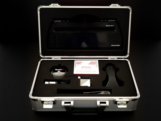
What’s Included?
Spyder5Elite:
The pinnacle of the Spyder5 range. Reminiscent of a hockey puck, it has all the sensors needed to ensure color, contrast, and brightness accuracy on your monitor(s).
SpyderCube:
Essentially a little cube that looks like a Christmas ornament that acts a bit like a gray card on steroids for accurate white balancing.
SpyderPrint:
A device that works with software to ensure that what you send to a printer is precisely what’s printed.
Datacolor Spyder Elite & Print Software:
The SpyderCube requires no software, and anyone can use it with success, but the other products must, in fact, be paired with their respective software. Sturdy plastic and metal carrying case that’s foam re-enforced.
So right away you can see that this system with the SpyderCube is going to help you capture for contrast and white balance in camera, then to open those images on a calibrated monitor to make sure you’re seeing what should be there, all the way to printing what you see as you see it.
A Little Background On Monitors, Color Spaces, & Calibration
If you’re already familiar with this matter, then you can skip ahead, but for those who are learning, or just want a refresher, allow me a few to give you some basic information to help you understand this somewhat alien world of calibration.
To understand the world of digital color, there are some fundamental concepts you should at least be familiar with, and possibly key among which for our purposes would be color spaces. Simply put, a color space is a defined range/spectrum of color tones available for a digital image. Given this, it’s forgivable to think that the larger the color space, the better, because it would include more tones, likely to give you more accurate images. This isn’t always the case for many reasons, a key among which is that many of the devices we use just aren’t capable of representing all the colors in a given color space.

You may have heard of ProPhoto color space, and AdobeRGB and sRGB color spaces as those three are the ones spoken about the most (There’s CMYK but for another day). ProPhoto is the largest of these three, meaning it will be able to encapsulate pretty much all the tones even the most sophisticated cameras on the market can capture.
Now, that’s great and all, in theory, but in practice, it’s useless for the average shooter (and even average pro). Most monitors, like the one you’re reading this on, are only capable of showing the sRGB color space, and then professional monitors, the Adobe space. In fact, to my knowledge there isn’t a monitor or a printer that can actually show the full range of the ProPhoto color space. So, which one you work in likely depends on what you’re doing with the image after. Here’s a look at how different color spaces encompass the others:


For example, even though something like CMYK has a smaller volume of tones generally (though more greens and blues than sRGB), you’ll want to work within CMYK if sending to a CMYK printer. Generally speaking, you’ll want to stick in sRGB for most of your work, even with really high-end monitors, simply because your web galleries and the monitors that they will be viewed on are not going to be able to show anything more than sRGB. Speaking of monitors…
Even the best of monitors are going to come out of the box imperfectly calibrated, meaning they won’t show you the most accurate colors within even a small color space! So if you asked it to show you a green it may bring up a ‘green’ as asked, but it may be polluted with a little bit of something else making it an untrue color. Maybe it’s a landscape you shot, and you can see the image doesn’t look like it did in camera or in real life, so you adjust it in Lightroom to make it look just right. The problem with this is that you’ve adjusted based on an incorrect color rendering, so your post processing is going to be way off once printed or displayed on a calibrated monitor.
For example, if you take that same landscape with a bride and groom in it, and maybe it was at sunset, so it’s a little warm, but in Lightroom, it shows up cooler than you know it should. So you go in and make it warmer till it appears just right as you think it should be on your uncalibrated monitor. But then you send this file to the printer that’s printing the album for your client, and the print comes out wayyy off (probably too warm) from what it should be.
Well, it’s not their fault. Firstly, most monitors today in the West show a lot cooler than what’s correct, and because any professional printer is using calibrated monitors and prints what they see. That print is probably very different than what you think you sent if your monitor is not calibrated. Irritating, I know. But this is the reason why you need to calibrate your monitor, and if you’re printing yourself, your own printer. Well, it’s one of the reasons. It’s also necessary if you use more than one monitor because if they aren’t calibrated and matched, then each will look different and you’ll process differently. So if you have a studio, or outsource your processing at all, you’ll want to make sure every monitor used will be matched, and adhering to basically what is an international standard.
SpyderCube
The world of digital photography has presented its own challenges and one of which is the tendency for cameras to be a bit ‘dumb’ when it comes to gray balance and white points within a given color space. Many of us will use 50% gray cards or as far as a color checker palette to ensure we are getting the ‘correct’ look. The SpyderCube is replacing the traditional gray card in favor of something that’s 3 dimensional and actually much more functional.

Using it is simple, though not quite as basic as a gray card. Given its cube shape, you hold it, so all of its faces of the cube catch all the light around, and you can see the black hole in the bottom. Basically, you can use this to balance for your primary light source since one side will be brighter than the other. Then the black hole becomes totally black and the little ball on top will show your specular highlights, allowing for all those to be managed within your post processing workflow. I’ll be doing a deeper review and explanation of how to use this product as it is something I feel many will find interesting, and ultimately useful.
Spyder5Elite
The Spyder5Elite is the meat and veg to this system as it’s the device that’s going to work with its software to calibrate your monitor while you’re having your morning coffee. And it actually only takes about that long to do. It’s a small device you can hold in the palm of your hand that resembles a hockey puck, and thus is often referred to as such.

It’s comprised of two main parts which are the main body that holds the main sensor and an ambient sensor, and a lens cap for protection which acts as a counterweight when the device is draped over your screen. The two are threaded by the USB cable that plugs into your computer, and this ‘new’ design is small enough and robust enough to be portable to carry with you anywhere. It also has a thread so you can attach it to a tripod mount that is handy if you’ll be calibrating very large screen or projectors. Yes, this Elite version included will calibrate projectors, as well as iPads. Sweet.
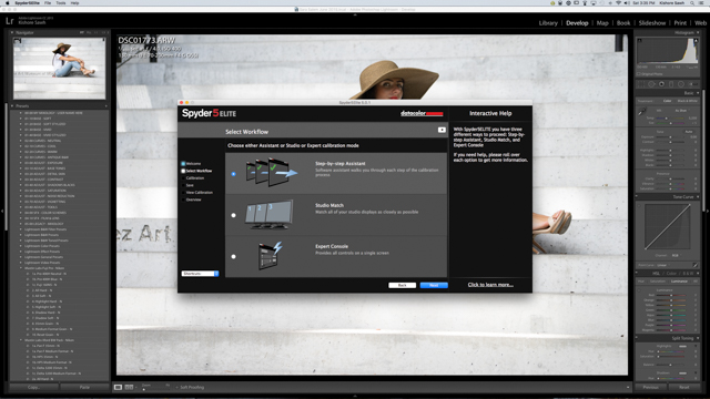
The Spyder5Elite as part of the Spyder5Studio is the highest end version of the Spyder5 as there is also the Spyder5Pro and Spyder5Express. They are all using the same hardware and, in fact, it’s the software that unlocks certain capabilities. So if you have the Express but want to upgrade after, you can just pay an upgrade fee without needing to purchase a new puck. Anyway, rest assured that with the Studio, you won’t need to do that because you’ll be getting the best. Speaking of studio, one of the things this Elite allows you to do is use something called Studio Match to calibrate and match-perfect all the monitors you use, and if you’re a working pro you’ve got at least two, so whether it’s you or someone else doing it, the same file can be worked with on various monitors and be the same.
So How Does It Work?
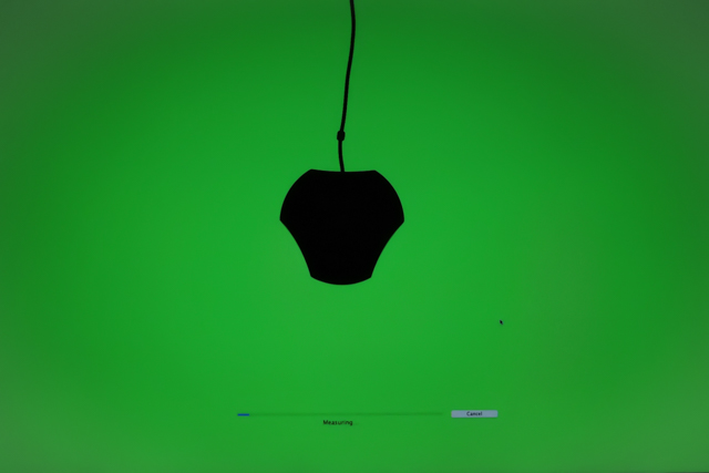
Magic, I suppose, or just far more technical than I care to explain. The basics would be that when it’s attached to your screen and the software is running, the software will tell the computer to show it various colors and the Spyder5 will look at it and measure it. So if the Spyder5 tells the monitor to show a specific green, the computer will generate it, but then the Spyder will read it and pick up any pollution.
It’ll then tell the monitor precisely where it’s wrong, and the monitor will adjust. This is done for the range, so the whole color range or map is rewritten to be ‘correct’ against the standard, taking into account ambient light and so on. So when a program tells the computer to generate colors in a picture, it will adjust itself to show the correct values. From your end though, it’s just a matter of a few clicks in a controlled room, and that’s it. You can fine tune it if you like, but in my experience it tends to be ok as is.

Fair warning, however, that if you’ve never calibrated your monitor before, you’re probably going to be a bit taken aback by how it looks when calibration is finished. Typically, it will appear warmer, and you’re going to think it didn’t work and so on, but I would suggest just leaving it and letting yourself adjust, which you will. Now, if it’s way-way off, then it likely has something to do with changing light in the room so just go somewhere where there’s no direct light hitting the monitor and that it stays the same.

By the way, the measurement tools can be helpful if you ever want to return a monitor. You can save your profiles each time and even graph old ones to see what percentage of a color space it’s using. So if you graph one on day one, then 6 months later, graph it again and there’s a 2% loss, then again there’s another 2 or 3% loss in another year or six months, that can be grounds and proof to take the monitor back to the manufacturer for them to fix or replace.
SpyderPrint
This is likely going to be the least used component of your system, but if you’re printing anything of your own you’re going to want to do it, and SpyderPrint will give you the ability to create paper, ink, and printer profiles. Even if you’re not printing on your own, the exercise is one of learning and will give you insight into how the whole cycle of capture to print works and why harmony between it all is necessary.

The Datacolor SpyderPrint software essentially is going to have your printer do some test charts comprised of many color patches. The Spyder software knows the correct values for each of these and when the printer has done the initial printing which in effect shows the printers current profile. You’ll then be asked to set a white point, and the device has a white point balancing chart at the base of its cradle. At this point, you simply use the Print device to scan them, upon which time the values read are compared to what they should be, and the software will pick up the variances and correct for them, so your print comes out precisely as it’s shown on screen.


This Sypder5Studio comes not only with the measuring device but with a guide that’s like a rail for the measuring device. This allows you to scan all the color patches with ease, making this a lot less laborious event than it used to be, so scanning both pages of the basic color chart (EZ) takes about 4 minutes. After this, you’ll have your new profile that loads onto your computer automatically. The real eye opener for you will come when you load that profile into Lightroom and do some soft proofing. It’s possible that you’ll see a marked difference between what your image is on screen and what your printer is going to put out. But now that you know this, you can either see if your printer is utter crap, or just how to tweak the image, so it prints just right. In my experience, it’s typically a matter on contrast and saturation.
[REWIND: DATACOLOR SPYDER5PRO GIVEAWAY! ($189 RETAIL VALUE)]
Conclusion
This is not a system for everyone, nor may it be a system for some of you right now. But it is a complete package for anyone serious about color management, and as a photographer you’d be a fool not to be. The thing is that even if you’re doing very basic things at this point, you should still be calibrating because if you’re not, when you go back to older work and would like to utilize it, there may be a mess on your hands. And this system is one you can certainly grow with.

It’s typically $499, but it can be had right now from B&H for $100 less for $399. Considering the Spyder5Elite alone is around $270, the SpyderPrint $299, and SpyderCube $49, this bundle is saving you north of $200. And what else is there really to speak of? The build quality of the devices seems to be good; it’s pretty much all plastic, but that makes sense, and the fit and finishes of all the components are great. The carrying case makes it great for travel and storage and protects it all nicely.
Possibly most importantly is how simple it all is to use, and yet how effective. Each step in the process has a small learning curve of a few minutes, and if you forget along the way the new software has great guidance and explanation built in. With this, you are going to take a major step to treating your work and time as a professional would, and there’s no excuse not to, even if it’s not with this product, but it’s hard to think of a better value in the photography world. It gets our stamp of approval.
We’re actually doing a giveaway of a Spyder5 at the moment which you can check out here, and check back soon for the full review on the SpyderCube.


Get Connected!