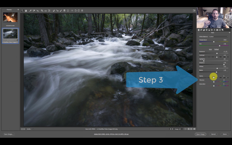
If you’ve ever taken an image with atrocious white balance, and, despite your best efforts at adjustment in Lightroom or Adobe Camera Raw, found it shifting from one color cast to another rather than becoming neutral, today we’ve got a tutorial for f64 Academy to help.
Some types of scenes are inherently more challenging to obtain correct white balance, and even though a good approximation can often be made in post using the white balance dropper, what can you do when there are no neutral tones to sample, or if what appears to be a neutral tone makes everything turn just a little green or another color when you sample it? In the field, you can carry a Color Checker passport or another white balance tool, but if you don’t have one or didn’t take yours out with you, there is a three-step technique to help you achieve correct white balance easily in post production.
Crank The Vibrance
Take the vibrance slider, and pull it all the way to the right. Observe your now-surrealist work of art and see which tones dominate the scene. In the example used, blue is clearly the color in charge. 
Adjust The Tones
To counter this is very simple: just pay a visit to the overall white balance slider and drag that thing in the opposite direction from the color you want to neutralize. So, for this image, you would drag the white balance from the blue side toward the yellow side until the scene no longer looks overly blue.
Once the main color that had taken over has been addressed, notice that other slider in the same area, the one that will shift tones from green to magenta. With the blue/yellow dynamic handled, how is the balance in the photo between magenta and green? If one is notably overpowering the other and you don’t like the way it looks, fix it with the slider the same as you did with the blue and yellow. Sometimes you may want to intentionally skew the color in one direction over the other, and that’s fine. Just make it an artistic choice and not an unskilled mistake.
Re-Adjust The Vibrance
Set the vibrance slider back to zero. You will notice that the overall vibrance has been neutralized from its original appearance before adjusting the colors. You can boost the vibrance back up until it looks, well, vibrant enough to counteract that effect.
Fast and easy color correction, just like that. One caveat, as this technique involves adjusting by eye it’s probably going to work best if you’re using a calibrated screen. In fact, it’s always a good idea to calibrate any screen you use to process photos.
[REWIND:] UNDERSTANDING WHITE BALANCE & COLOR TEMPERATURES IN 8 STEPS
Two widely-used consumer screen calibration devices are the Spyder Pro and the ColorMunki Display, which is the one I currently use after owning both types. Both work well and are fairly simple to use. It’s a relatively small investment and a must for those who are serious about their images.


Get Connected!