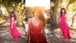
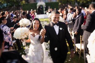
Despite playing a more supportive role in photos, backdrops significantly impact the final image. The best backdrops work in tandem with the subject, allowing them to pop for bolder occasions or remain subdued when the mood calls for it. To help ensure your backdrop is working with you, one of the most important elements you’ll need to consider is backdrop color. Different colors feature tones that can change the mood of your portraits, especially in relation to the color of your subject’s hair, eyes, clothing, and more. Once you understand how the backdrop color can affect your portraits, you’ll be able to better control the mood of your photos.
5 Tips for Choosing the Right Backdrop Color
- Start with Your Purpose
- Consider Backdrop Material Vs. Backdrop Color
- Match the Backdrop Color to the Lighting and Mood
- Factor In the Subject’s Wardrobe Colors
- Keep the Backdrop Clean
1. Start with Your Purpose
The most important factor in choosing a backdrop color is the purpose of the photo. Corporate headshots, for example, should use a neutral, standard backdrop color like white, black or textured brown. Product shots for marketplaces like Amazon will likely require pure white. And lifestyle brand photos might incorporate more on-location scenery. Each shoot is different. It may help to ask your client to create a moodboard so that you can clearly determine your purpose. According to Kate Backdrop, “A right backdrop can infuse personality into your sessions. You choose one by its pattern, color or images printed on it, and anticipate how well it complements the model.“
2. Consider Backdrop Material Vs. Backdrop Color

If you plan to use a traditional photography backdrop, rather than the location, you should familiarize yourself with several options. As you can imagine, photography backdrops vary in size, color, quality, and cost, so there’s plenty to consider. For the purposes of this article, however, we’ll look at choosing backdrop materials in relation to their impact on color and the purpose of your shoot. Here’s a quick overview of some available options.
Seamless Paper
You’ve likely seen rolls of seamless paper used in fashion portraits and product shots. They’re relatively easy to use and offer a portable alternative to ‘cyc’ walls. Seamless paper lets photographers create a clean look with smooth transitions, directing most of the attention to the subject. While black, white, and grey make up the most popular colors, you can choose from dozens of colors to suit your purpose. The best part is, if the paper gets scuffed, you can easily roll out some more and cut off the unwanted portion.
Vinyl
For photographers seeking a durable, flat backdrop with options for a matte finish that won’t reflect the lighting, vinyl may be the best option. It’s important to keep in mind that, unlike the seamless paper, vinyl’s heavier weight makes it harder to move around and hang at various locations. For a studio setting, however, vinyl makes a strong case for selection, especially when you need consistent results through several shots, such as for corporate headshots or a similar gig. In terms of available colors,
Muslin
Another lightweight, highly portable option, muslin backdrops are made from 100%, densely woven cotton. You can pick this backdrop up in a variety of solid and textured colors. Because of the texture in muslin backdrops, lighting plays a big part in how muslin backdrops look, and they won’t provide the consistency you’ll get from vinyl backdrops.
Hand-Painted Canvas
Annie Leibovitz uses hand-painted canvases for portrait backdrops on the regular. These backdrops feature multiple layers of paint to create a rich texture and they provide an elegant setting in which to feature your subject. Hand-painted canvases range in price, although they lean more towards the expensive side, but the results (can) justify the cost.
3. Match the Backdrop Color to the Lighting and Mood
As I mentioned up top, color significantly impacts the mood in photos. The same is true for lighting. Here’s a quick overview of some color options and how they might be used to match lighting and mood in portraits. These tips apply to dominant colors backdrops you find on location, as well, and are not limited to hung backdrops.
White Backdrop Color

White stands as the hands down most popular backdrop color. It’s clean and free of distractions, and it makes a perfect partner for high key, bright and airy photos. White backdrops work well with whatever colors your subjects might wear and the neutral color can change with lighting. Throw a colorful gel on your flash and viola, you have a convincing new backdrop color.
Black Backdrop Color

Black backdrops provide a perfect canvas for professional, clutter-free portraits. They can add a dash of elegance to headshot photos and also introduce a touch of mystery, depending on your lighting. This timeless backdrop color serves as a neutral partner who’s ready to let the subject shine.
Grey Backdrop Color

Boasting a neutral color, grey backdrops allow photographers to draw attention to the subject with minimal distractions. Photographers often turn to grey backdrops when shooting fashion portraits or product shots (those not intended for sale on Amazon). Lower the ambient light when dialing in your exposure and use added light on your subjects to draw them out even more.
Red Backdrop Color
Perhaps more so than the other colors on this list, red demands the viewer’s attention. People often associate red with love, energy and passion, and it’s even used in fast food establishments to make people hungry. On the other hand, people also “see red” when they’re angry. This is no doubt one of the bolder options on this list and should be used sparingly, always with intention.
Yellow Backdrop Color

When you think of yellow, chances are you associate its brightness with happiness and energy. As a backdrop color, yellow certainly falls on the high energy side, making a great option for kids portraits or generally upbeat images. Ask your subjects to wear complementary colors (blue or purple) to really make them pop from this bright backdrop.
Green Backdrop Color
We often associate green with earth, and various tones of green can have a calming effect when used in our backdrops. Darker shades of green, however, have other connotations, including envy or the pursuit of wealth. For the latter, using dramatic off-camera flash and low ambient exposure can go a long way towards establishing an editorial style portrait.
4. Factor In the Subject’s Wardrobe Colors
You may want to establish harmony between your subject’s wardrobe colors and the backdrop, or you might choose to create tension. Again, this goes back to starting with your purpose. Whichever direction you choose, you must understand color theory and recognize the impact that your subject’s wardrobe choices will have on the image when contrasted with the backdrop color.
5. Keep the Backdrop Clean
Unless you’re shooting at an extremely shallow depth of field or else want to spend time cleaning up distractions in post, keep your backdrop clean. Lighter colors, especially white, will require more maintenance. It’s easy enough to do with some materials, like seamless paper (which allows you to easily cut off the dirty areas), but others, like a hand-painted canvas, may require special care. Of course, if your backdrop features a heavily textured look, then maybe a little added debris won’t hurt.
Conclusion
I hope you found these tips on how to choose the right backdrop color helpful. Because of the variety of options you have available, from colors and textures to backdrop materials, honing in on your best option can sometimes feel overwhelming. However, the more you work with backdrops and understand how they impact the mood of your portraits, the easier it will become to select the best backdrop for your shoot.


