Drama by definition is an exciting, emotional or unexpected series of events. We as photographers often utilize drama in our visual language as a way to enhance our storytelling. Think about what drama means to you. Is it darkness and shadow? Contrast? Mood? Expression? Mastering all these elements is integral in creating drama within your own images. It can obviously be crafted in a number of ways, but here we are going to focus on my five favorite techniques: using a large modifier, feathering light, grids, the flag, and coaching expressions.
Misconceptions About Dramatic Portraiture
There are a few of things that many people think a dramatic image needs to be that isn’t necessarily always true. To begin, let’s dispel a couple of misconceptions about the requirements of a dramatic image.
“It must be dark.”

Although dramatic imagery is often dark, this isn’t something that needs to be true 100% of the time. There are more ingredients than just “darkness,” and an image shot on white is no less dramatic because of its background choice. Here, drama comes from the power pose, the expression and the high contrast.
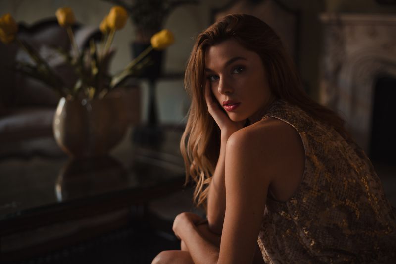
“It must be sad.”

Later, we are going to talk about expressions and how they contribute to the dramatic portrait, but do not feel locked into an idea of “moodiness” or “sadness.” Drama is about tone, and that can be achieved in multiple ways. In this image, the light-hearted expression still feels dramatic because of the lighting, wardrobe and low-key development of the image.
“It needs special lighting.”

Many people can get wrapped up in limitations they put on themselves. For example, “I can’t do something because I don’t have a ____ kind of lighting.” While this can be true in very specific circumstances, often a style can be crafted with a number of different tools. The above image was shot with natural light, but the expression, pose, lighting and wardrobe all contribute to the image’s drama. These are just a couple points to consider when using natural light to create dramatic portraits.
Using a Large Modifier

One of the things that I didn’t quite fully understand for a long time is how effective a larger light source can be compared to a smaller one. Whether it’s a large umbrella (one of my favorite modifiers), rectangular softbox, octabox, etc., the bigger it is, the softer and more contrasty it will be on your subject. Let’s break down both of those components.
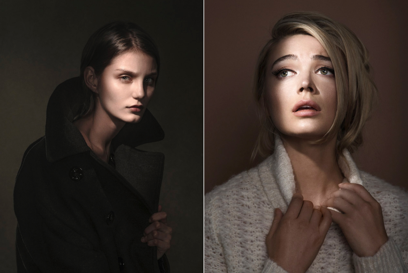
Soft light has more gradual transitions between light and shadow and is more forgiving on skin texture when compared to a harder light source. Light can be made softer by modification or distance. The most significant determining factor in regards to softness of light is relative size. The larger an object is relative to the subject, the softer it will be. Therefore, a larger modifier, relatively close to the subject would be very soft. Let’s compare:

In the image in the left, the light is a bare head, which results in a hard edge to the shadows and specular highlights. Those highlights accentuate shine, sweat and texture and are generally less forgiving on skin. In the right image, a large umbrella with diffusion is used, the shadow transition is much more gradual and the skin overall appears more flattering.


The small umbrella on the left has a slightly harder, more defined shadow than the larger umbrella on the right. Although umbrellas are already some of the softest modifiers you can use, there is a slight difference in size even though both are relatively close. The power of both lights was slightly adjusted (the larger umbrella needed a higher output) to maintain the same f/stop in camera. Notice as well, the very slight gradation on the background of the left image, whereas the larger umbrella illuminates the scene more evenly.


Here, the “relative size” principle is more obvious. The same modifier is used at the same power setting (the camera’s f/stop was compensated to maintain exposure), but the right image backs the light up by several feet. The left image has softer light compared to the right as well as a stark difference in the appearance of the background.
As you may have noticed in the examples above, the harder light appeared more “contrasty” – meaning the shadows were more aggressively defined in the image. We can still make soft light contrasty, but now we have to consider distance. The closer the light is to your subject, the brighter it will be, resulting in a greater disparity between highlight and shadow. This also means higher contrast. As it moves away, the opposite is true. You may know this as something called the “inverse-square law.” It basically says that a light’s power doesn’t directly correlate to its distance; instead it changes exponentially (As you move n times further away, your power gets n2 times weaker). Something twice as far is 4x weaker and something three times as far is 9x weaker. Very close light = very powerful and contrasty. Farther away = less powerful and less contrasty.


Close to the light: high contrast and quick falloff. Farther light: Still kind of high contrast, but definitely less. There is a slower falloff as well. In both, the exposure is set to the subject’s face.
Feathering the Light

The inverse-square law indirectly touched on the idea of fall off. Feathering the light builds on this concept somewhat. It’s important to remember that light has a shape (a cone) and the cone moves through space as it gets father from the source. Recognizing the edge of that light (the cone) allows for a more nuanced control of the lighting in the scene.
One of the most common uses of this technique is known as “feathering the light.” Light is brightest in the middle. Often this extra contrasty light or “hotspot” is not ideal on the subject. It appears a bit hot (bright) or uneven when compared to the rest of the light on your subject. This may seem counterintuitive to the previous point, but know that a) some people like a consistency of light on their subject –especially when lighting softly – and b) everything is up to personal taste anyway. Just know the results of what you’re doing and whether or not you want them.
Feathering in the light from the background means we can still utilize the larger, soft modifier, but can turn it so that the light is not on – or partially on – the background. This allows for a greater control of contrast in the scene.


As the light it turned, it no longer lights the background, but the subject’s face remains lit.
Grids

Light is largely about putting light where you want it and blocking it where you don’t. Light shapers like grids allow you to create more specific pockets of light anywhere you want to put them. The only caveat to this is that you will often need more than one light to use them effectively. They can work creatively as the only light source of the scene but are more regularly used as secondary sources. Grids come in different degrees – smaller numbers mean a tighter beam.

Left to right: No grid, 5 degree, 10 degree, 20 degree. Also remember that distance contributes to the spread of light as well.
The Flag

This tool is all about blocking light where you don’t want it to be. One of my favorite tools, this is one that doesn’t always get a whole lot of love – especially with portrait photographers. The flag is a metal frame wrapped in black fabric that absorbs or blocks light. The flag can be used to create negative fill, because the fabric absorbs light, making the unlit area darker (thereby increasing contrast). It can also taper light (similar to barn doors, except not mounted to the light) to prevent light from hitting the background. There are a seemingly infinite amount of ways flags can be used and therefore makes them one of the most versatile light shaping tools.

Left to right: no flag, flag as negative fill, BTS of setup

Left to right: no flag, flag blocking light from background, BTS of setup
Coaching Expressions

Don’t overlook the importance of the expression in a photograph; it may be one of the single most important elements. Every portrait photographer has his or her own bag of tricks when getting expressions from his subject. Richard Avedon, for example, once photographed the Duke and Duchess of Windsor, who were avid pug lovers. Avedon, on set, begins to tell a story of how, on the way over, his taxi hit and killed a dog (it wasn’t true). His subjects were horrified. He took photographs. There is a much deeper story at play here, speculating why Avedon wanted to make them look bad, but I won’t get into it here.
Certain photographers only seek a flattering representation, others need to service an accompanying story or please a photo editor. An expression often dictates the emotional response of the viewer as well. Expressions are one of the most important elements that not enough people focus on. A portrait is often won or lost here; The Mona Lisa, Girl With a Pearl Earring. They are enigmatic and stand the test of time largely because of their expression.

Wrap Up
[RELATED: CHRIS KNIGHT RAPID INTERVIEW | DRAMATIC PORTRAITS & THE BUSINESS OF PHOTOGRAPHY]
Dramatic portraiture can be serious, moody, mysterious, cinematic. The ways in which you as a photographer (and ultimately a visual communicator) craft these tones are all about helping you tell a more engaging visual story.
Dramatic portraiture is all about light, creating a mood and showing emotion, not just with the subject themselves, but also the way in which you capture them. Drama is an impactful tool when creating the narrative of an image. It is powerful, effective, and speaks to a multitude of elements in the psyche. It isn’t for everyone or every situation, but can be incredibly useful when you use it well. For much more on dramatic portraiture, check out my book, The Dramatic Portrait or my video tutorial with PRO Edu.
*This post has been updated and was originally published in June 2017