
When you look at a photograph, what do you see first? That’s your focal point. Where does your eye go next? In an interesting composition, there’s generally a hierarchy of interesting elements for your eye to see and the order in which you see them describes how much “Visual Weight” those elements carry. Visual Weight is a compositional device used in photography to attract your eye to a focal point. Visual Weight in photographs is influenced by a number of factors, which you can use to strengthen the focal point and create balance in your image.
How to Create Balance in Photographs with Visual Weight
Here are a few concepts to keep in mind when creating a balanced composition using Visual Weight. Remember, you can break these rules to deliberately create tension, imbalance and unrest in your images, if that’s what you’re going for. These are merely concepts to help you improve your composition. When you’re looking at an image and it just doesn’t feel right, look for some of these and decide how you could have made it better. Deliberately practice these concepts and soon they will become second nature while you shoot.
Faces & Eyes
Our human brains are wired to look at faces and eyes first. If there’s a face in your photo, it will likely have more visual weight than other elements. If you want the viewer to focus on something other than faces, consider not including them at all. If the eyes of your subject are looking off the page or not directly at the viewer, we tend to look in the direction those eyes are looking. We want to know what they are looking at.
Text
As literate beings, we look for and try to make sense out of letters and patterns. Our eyes are drawn to signs or text of any kind in an image. Being aware of this can help you remember to avoid text if you really want the focus to be on something else.

Value & Contrast
Our eyes are naturally drawn to the area of highest contrast in an image. This could mean the lightest area, darkest area, brightest color, etc. depending on the scene. This is an easy one to create with artificial lighting if your image is lacking interest. For more information on using flash to create contrast in your images, check out our lighting courses, beginning with Lighting 101. Click here to view more details.

Size
Larger objects feel heavier than smaller objects. They command more attention. We naturally see them first or spend more time looking at them, anyway. Remember, this rule could be trumped by any of the other factors we’re discussing here. If the smaller object is higher contrast, for example, our eye might go there first.

Position
Elements placed far from the center will feel heavier. A large object in a scene near the center of the photo can be balanced by a smaller object placed closer to the edge of the frame.

Quantity
Multiple small objects can balance one larger object. Repetition of objects can be used here as well. In the example below, the two small chairs are balancing out the large area of ocean and sky.

Isolation
An isolated element has more visual weight. Imagine a blank white canvas with one red dot on it. Your eye would go directly to the red dot first because there’s nothing else to see.

Shape
Complex shapes in a scene feel heavier than simple shapes. Humans are complex shapes, so placing them on a simple shaped background is an easy way to make them stand out.
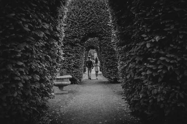
Negative Space
A large area of negative space can balance out smaller objects on one side. The negative space essentially acts like a large shape. In this example below, negative space and contrast are working together to draw your eye to the focal point.
Depth of Field/Focus
Objects in focus will generally carry more visual weight than those that are out of focus. This is a quick and easy way to draw attention to your focal point in photography. Shooting with a wide open aperture and longer focal length lens can help you achieve this.

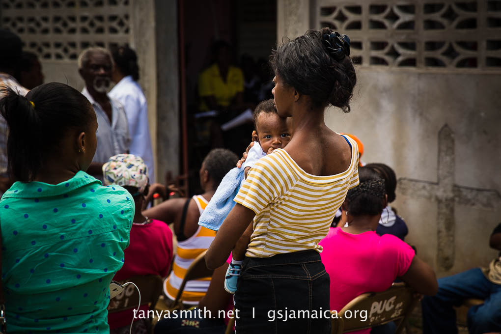
Color
The brighter and more intense its color, the heavier the element will feel, especially if it’s a contrasting color to the other colors in the image. In the example below, my eye goes directly to that red t-shirt first because it’s the brightest and most contrasting color in the scene.

Texture
Texture adds visual weight to items in photographs. Texture is just more interesting and our eyes are drawn to it. Smooth areas will feel lighter than those with a lot of heavy texture.

Orientation
A diagonal orientation carries more visual weight than a horizontal or vertical one. This is why a tilted horizon line makes your subject feel like they are falling off the page. Lines can be very powerful, for good or for bad in your composition. Pay close attention to them. Take a look at how the tilt in the horizon-line on these three images changes the feel of the composition.


In the end, as you evaluate your composition, or the composition of photos you admire, pay attention to whether or not it feels balanced. Try to determine which elements are commanding the most visual weight. You can often change the balance by simply cropping or cloning out a distracting element.
For a more in-depth look at composition, check out our Photography 101 video workshop. Click here to view more details
Other articles you might like:
FIVE FUNDAMENTAL COMPOSITIONAL THEORIES YOU SHOULD MASTER TODAY
FIVE MORE RULES TO ROCK YOUR PHOTOGRAPHY COMPOSITION
COMPOSITION TIP: AVOID HIGH CONTRAST SHIFTS
PHOTO COMPOSITION: 9 BASIC GUIDELINES FOR BETTER PHOTOGRAPHS


Get Connected!