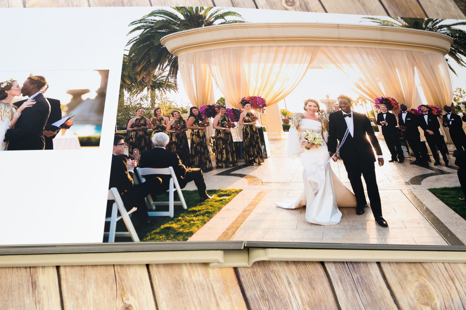
Watch someone open an album you designed and count the seconds between page turns. Around the fourth or fifth spread, most people speed up. They stop reading and start flipping. The photos didn’t get worse. The story did. Learning how to create a photo book is mostly a sequencing problem, not a photography problem, and it’s the part almost nobody practices. This guide covers cutting down to a working set, picking the opening image, the five image types every book needs, pacing, spread design, editing consistency, print prep, and choosing the frame you end on. Everything here comes out of designing wedding albums, family books, and personal travel projects, where the same mistakes show up over and over.
Sequencing matters more than your best frames
Your 40 strongest images are not a story. They’re a highlight reel, and highlight reels exhaust people fast.
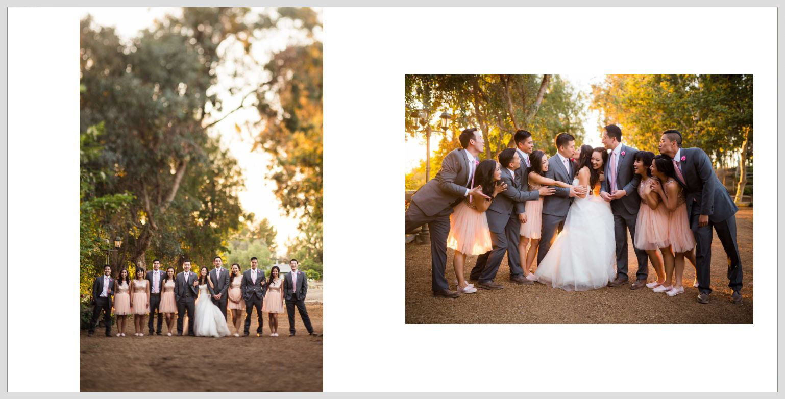
In our experience, a merely good photo placed correctly does more work than a great photo placed badly. A quiet frame of an empty ceremony chair means nothing on its own. Put it on the page before the guests walk in and it becomes anticipation. That’s the whole job: every image borrows meaning from what sits next to it.
Cut first, design second
A typical eight-hour wedding gives us around 1,100 frames. The delivered gallery lands near 600. The album gets 50 to 60. That last cut is where the book is won.
Work in passes instead of trying to choose perfectly the first time through. First pass: keep anything you’d defend. Second pass: one frame per moment, no exceptions. If you shot 14 images of the first look, the book gets one. Third pass: read the remaining set as a sequence and cut anything that repeats a crop, an expression, or a location you’ve already covered.
Honestly, most albums we see get sent back for revision because they’re 90 images long and should have been 45.
Choosing the opening image
Page one is not where your best photo goes. It’s where context goes.
The opening frame should answer where we are and what kind of day this is, and it should do it calmly. Wide, tonally even, negative space somewhere in the frame so a title or date has room to sit. For a Malibu wedding we opened on the venue at 7am with the chairs still stacked, shot at 24mm from the hillside. Not a dramatic image. But it set a place, and everything after it had somewhere to happen.
Save the showstopper. You’ll want it later.
The five image types every photo book needs
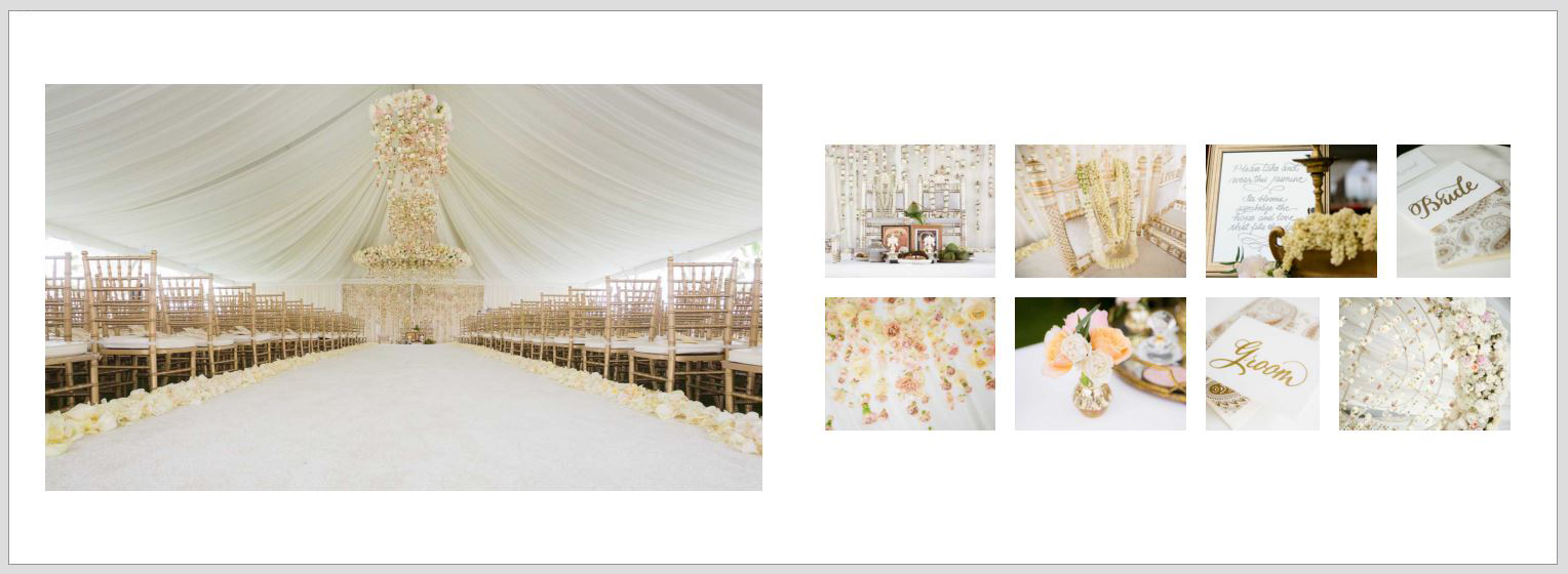
A book that reads well almost always cycles through five kinds of images:
- Establishing shots that give place and scale
- Details like rings, hands, invitations, textures, the things that date and locate a memory
- Portraits that tell us who this is about
- Moments, unposed and reactive
- Breath images, quiet frames that reset the pace before the next section
Here’s the part most layout guides skip: the fifth type is the one photographers under-shoot and under-place. Breath images feel expendable during selection because they’re not impressive in isolation. They’re what keeps a 60-image book from feeling like 60 images shouting at once. An empty aisle, a hand resting on a chair back, a wide shot of a room half-lit. Budget three or four of them per book.
One image displayed large beats three small ones
This is the single highest-leverage change you can make to a photo book layout.
When you have four frames from the same moment, the instinct is to grid them so nothing gets left out. Resist it. Four small versions of one moment read as indecision. One frame printed full-bleed across a 12×18 spread reads as a statement, and it’s the version people stop on.
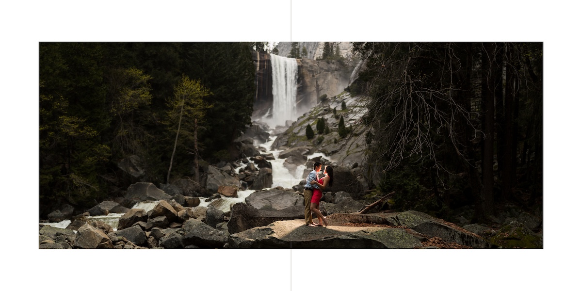
We’ll be direct: if you can’t decide which of three similar images is strongest, that’s a sign none of them is carrying the moment, and you should be looking at a different frame entirely. Grids earn their place when the images are genuinely different, a sequence of reactions across a row of guests, or four details that belong together. They don’t earn their place as a hedge.
Size is emphasis. If every image is the same size, nothing in the book is important.
Chronological order is a default, not a rule
Time order is the easiest structure to build and it’s rarely the best one.
The clearest example is the night portrait. On most weddings, the off-camera flash portrait of the couple happens somewhere in the middle of the reception, maybe 8:40pm, squeezed between dinner and dancing. In the timeline it’s an interruption. In the book it’s the closing image, because it’s the frame that feels like an ending: dark, still, just the two of them, everything else resolved.
The same logic applies well beyond weddings. Travel books often read better grouped by place or light than by day. Family projects usually work better grouped by relationship. Ask what each image feels like rather than when it happened, then build the arc from that. Nobody looking at the finished book knows or cares what the EXIF timestamps say.
Pacing and how fast someone turns the page
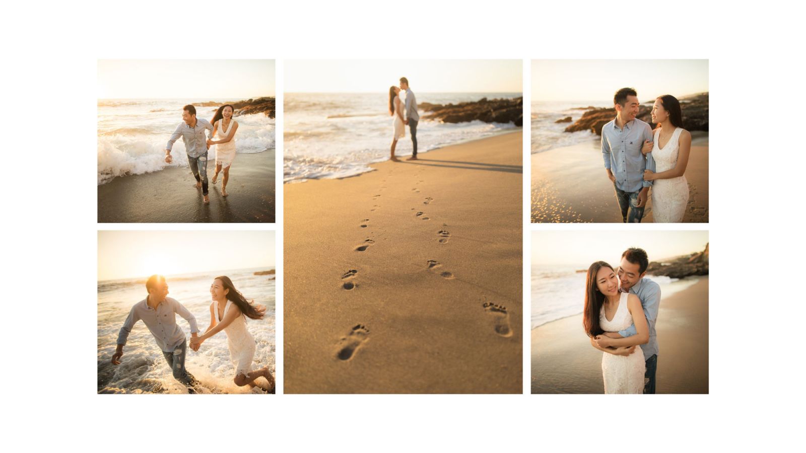
Example of Album Spread with Storytelling Elements. No AI can replace good angles, expressions, and stories.
You control reading speed with size and density. A single full-bleed image slows a viewer down. A dense spread speeds them up. White space is a pause, and pauses are what make the loud pages land.
A rhythm that’s worked for us on 30-spread albums: open wide and slow for two spreads, build density through the middle of a section, then drop to a single large frame at the emotional peak of that section before transitioning. Repeat per chapter. The book breathes instead of running flat.
Design spreads, not pages
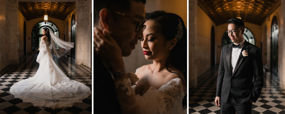
Nobody sees a single page. They see two facing pages at once, so the spread is your actual unit of composition.
- Match tonality left to right. A bright high-key frame facing a moody underexposed one fights itself.
- Watch gaze direction. Two subjects looking away from the gutter pushes the viewer off the spread in both directions.
- Keep faces and critical detail at least 0.5″ off the gutter unless you’re printing lay-flat.
- Don’t center a face on the spine. Ever.
Transitions between sections
Getting from getting-ready to ceremony without a hard cut is a craft problem with four reliable solutions: bridge on color, on direction of movement, on a repeated subject, or on scale. A detail of the dress on the left facing a wide of the aisle on the right works because the eye travels from small to large and reads it as a step forward.
Keep one editing style across the whole book
Mixed post-production is the fastest way to break a photo book, and it’s more common than you’d think, especially on personal projects assembled from images edited months apart.
A warm film-toned frame facing a cool clean-edit frame doesn’t read as variety. It reads as two different photographers, and the viewer’s attention shifts from the story to the inconsistency. Three black and whites scattered randomly through a color book have the same effect.
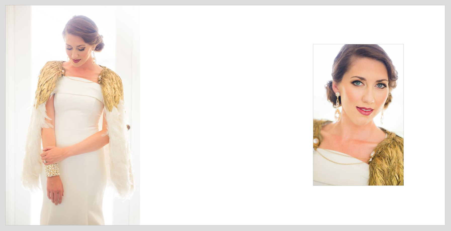
Pick one look and run the whole book through it. If you want black and white, use it structurally: a full section, or a consistent role like every detail shot. Before you export, put every image on one screen at thumbnail size. Inconsistent white balance and contrast jump out immediately at that scale, and it takes about 90 seconds to check.
Turning your sequence into a printed photo book
Sequence first, layout second. Build the running order as a numbered folder of exports, then move into a photo book maker and drop the images in already in order. Laying out and sequencing at the same time is how books end up chronological by accident.
Export specs that matter:
- sRGB, not Adobe RGB. Nearly every consumer print pipeline converts to sRGB, and sending Adobe RGB files is why prints come back flat.
- 300 dpi at final print size. A full-bleed 12×18 spread needs roughly 5400×3600 pixels.
- Leave 0.125″ of bleed and keep anything critical 0.5″ inside the trim.
- Choose paper before you finalize contrast. Matte stock eats about a stop of apparent shadow detail compared to lustre, so heavy blacks that look right on screen can block up.
Choosing the closing image
The last page is the one people remember, which is why it deserves as much thought as the cover.
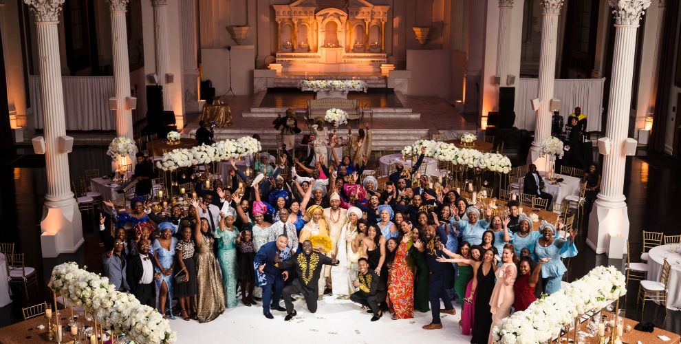
Three endings that consistently work: departure (someone walking away, a car pulling out, a door closing), resolution (the night portrait, the quiet moment after everything), or an echo of your opening frame shot from a different angle or at a different hour. That last one is the strongest of the three when you can pull it off, because it closes the loop the book opened on.
Mistakes that flatten a photo book
- Too many images. Sixty well-sequenced frames beat 100 comprehensive ones.
- Defaulting to chronological order without asking whether it serves the story.
- Gridding multiple frames of the same moment instead of committing to one.
- Mixing editing styles across spreads.
- Spending your strongest images in the first five spreads and coasting to the end.
- Repeating the same focal length and crop for pages at a time.
Build a 20-image test book this week
Constraints teach sequencing faster than a full album does. Pick one shoot you know well. Cut to exactly 20 images. Give yourself one establishing frame, at least three details, at least two breath images, and no more than two grids in the entire book. Then order it twice: once chronologically, once by feel. Print both as PDFs and look at them side by side.
This surprised us the first time we tried it as a team exercise: five photographers built the non-chronological version and all five preferred it, including the two who’d argued that time order was non-negotiable.
Photo book FAQs
How many photos should a photo book have?
For a wedding album, 50 to 70 images across 25 to 35 spreads is the range that reads well. Travel and family books can run leaner, often 30 to 40. If you’re over 100, you’re building a gallery, not a book.
Should a photo book be in chronological order?
Not necessarily. Chronological is the safe default, but the best closing image is often one captured mid-event, and grouping by mood, place, or relationship frequently reads better. Sequence by how images feel next to each other, not by timestamp.
What resolution do photo book images need to be?
300 dpi at final printed size, exported in sRGB. A full-bleed 12×18 spread needs about 5400×3600 pixels. Add 0.125″ bleed and keep faces and text 0.5″ inside the trim line.
How do I keep colors consistent across a photo book?
Edit the entire set in one session with one profile or preset applied as a baseline, then review every image at thumbnail size on a single screen before export. Inconsistent white balance is invisible at full size and obvious at thumbnail size.