Color management is something that I’ve been passionate about for the longest time now. Eight years ago, I purchased a new monitor and spent six months retouching work before realizing that my monitor was calibrated to be too warm, and six months worth of work was too warm as a result.
Before that, I cared little for color accuracy and thought that all monitors were mostly accurate, but after this six-month sting of my work not being what I hoped it was, I decided to get passionate about color accuracy, swapped out my monitor for something more accurate, bought a screen calibrator, and got to work. So let me share my eight years of experience as I’ve worked my way around trying to debunk color accuracy and management…and let’s start with monitors.
*Find a list of recommended monitors at the bottom.
Intro To Color Theory & Practical Tips | The Divisor Between The Pro & Amateur
Finding the Right Monitor
There are thousands of options when it comes to selecting a monitor, with an overwhelming amount of information given in regards to them. So let’s break down the most common, and most important specs to look for when buying a new monitor.
First, however it’s important to recognize that not all monitors are created equal. This applies to all gamuts, even to the same exact same monitor model. Not all ‘premium’ brands make good monitors, and the price does not always equate to quality. Monitors are built for a large variety of uses, so find one with color management in mind (a gaming monitor may have terrible color reproduction, for example).
*Do rigorous tests with new monitors of its color accuracy with a calibrator, check for dead pixels, and send it back if it’s something you’re not happy with.
10-Bit Display
The most important factor when choosing a monitor is finding what color depth your monitor has. Generally speaking, monitors come in two varieties, 8-bit and 10-bit displays. 8-bit color depth means your monitor can display 16.7 million colors, with 256 shades of each individual color. 10-bit displays, however, allow for 1.07 billion colors, or 64 times more colors (1024 shades of each individual color). Make no mistake, to get full sRGB (and AdobeRGB) coverage, you need a 10-bit display monitor.
sRGB & AdobeRGB coverage (Color Gamut)

And on that note, let us talk sRGB and AdobeRGB together. It’s typical when selling monitors for companies to provide the coverage of sRGB and AdobeRGB in percentage form, and when you’re looking at monitors for photography and video, you want to find something that has at least 97% of sRGB coverage, ideally 100%.
The default web standard for color management is sRGB, and the only way to assure you see all the colors on display when browsing the internet is to have full sRGB coverage. AdobeRGB has 35% more colors over sRGB and would provide higher-quality gradients and presentation of your work when displayed locally (not on the web). While AdobeRGB is not as important as sRGB, the higher the number you have in coverage of AdobeRGB, the better. Failure to have a wide color display will result in color inaccuracies, inconsistent gradients, and dull colors.
Contrast Ratio
Contrast ratio is a number represented to show the amount of contrast from the brightest whites, to the darkest blacks. Primarily, this is used to determine the dynamic range of a monitor. This number is usually measured by a #:1. Without going too far into this, I recommend a contrast ratio of at least 800:1, to assure you’re getting the whitest whites, and the blackest blacks. Again, the higher the number here, the better.
IPS Display
Another commonly referenced tech jargon when it comes to monitors is the phrase IPS or In Plane Switching. A misconception that many have is that IPS means that your monitor is more color accurate. While I do recommend an IPS display, the phrase has no bearing on how color accurate the monitor is. It does, however, allow for a larger viewing angle. If you remember from older monitors, particularly laptops, you’d lose color accuracy when you’d view them from an angle, getting almost a negative effect when viewing at strong angles. IPS monitors allow for a larger viewing angle, usually around 178 degrees, and assure better color reproduction at off angles.
Resolution

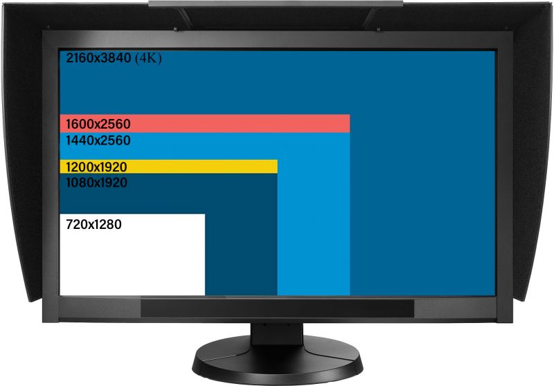
Far less important when it comes to photo editing is the resolution of the monitor. While a 1080p minimum is recommended, there isn’t as much of a need to have a 4K monitor for editing photographs. However, if you are doing video editing as well, 4K monitors provide some future proofing to your workflow (as 4K will be the standard) and allow you to edit UHD videos without downsampling.
Refresh Rate
Recently, another number commonly brought up with regards to monitors is ‘refresh rate’, usually represented in Hertz, and most typically you’ll find 60Hz or 120Hz displays. All this means is how many frames a monitor can show in a given second. 60Hz monitors are displaying images at 60fps, whereas 120Hz monitors are displaying images at 120fps. This number is usually referenced most for gamers and video editors where the smoothness of display movement is a big factor. For photo editing, 60Hz is fine, and is more than enough to have a fluid movement for photo editing.
Response Time
Similarly to refresh rate, response time is also a common figure used when advertising monitors, particularly for video editors and gamers. Response time is the time it takes for a pixel to change, measured in milliseconds (ms). When gaming, you may notice a significant difference in your performance when upgrading a 10ms monitor to a 2ms monitor, but you won’t see much of a difference when photo editing, so this number doesn’t apply much for us for the purpose of photography.
Common Misconceptions
I have an iMac/EIZO/Other Popular Brand, so I’ve got the best monitor available
Sadly, this is not the case. Even popular brands, known for their color accuracy (such as NEC, BenQ, and EIZO) have a long list of products with a large variety of intended markets. Not all EIZO monitors are good for color management, and not all Apple products are either. For example, while most Apple displays support at least 99% sRGB (& 75-80% of AdobeRGB on average) after 2015, they still lack high contrast ratios when compared to a dedicated display for photo editing.
I bought a high-end monitor, so I don’t need to calibrate it regularly
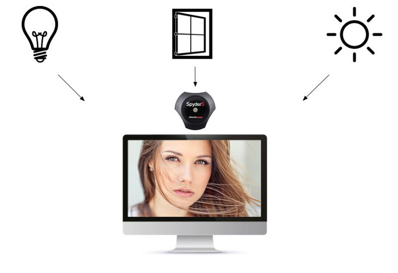
Sadly, this also isn’t true. While most high-end monitors are color calibrated at the factory before shipping, color accuracy will fade over time. Most monitors use LCD backlights, which will lose color and brightness over time. For this reason, it’s important to use a calibration tool, like a Spyder5, regularly, which is able to correct the fade that occurs in LCD displays. My recommendation is to recalibrate your monitor every 2-4 weeks to assure colors are accurate.
I should keep my monitor brightness maxed out, to make sure I have the highest contrast ratio
No. Finding how bright you should have your monitor is completely dependent on the environment you’re editing in. Our eyes will adjust to block out light, with our pupils contracting and dilating depending on the environment we’re in. For this reason, I recommend a screen calibration system to determine which brightness setting is best for you. Good monitors that have hardware calibration will generally set your brightness for you once calibrated, and otherwise most calibration systems will also set that as part of your calibration profile.
Our Recommendations
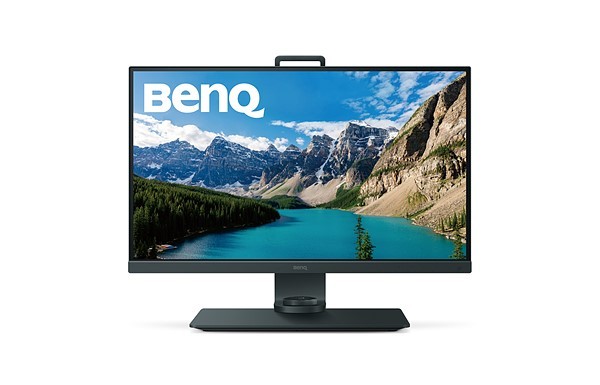
As mentioned at the start of this article, there are so many different options when it comes to monitor selections, so I’m here to help out and give you some of my recommendations, as of June 2018. At this point in time, I’m currently working on a BenQ SW271 as my main monitor and a BenQ SW2700pt as my secondary monitor, though I’ve used photo editing monitors from a large variety of brands and price ranges over the years. So while I do not have personal experience with everything on this recommendation list, I have checked the numbers, gotten feedback from other users, and have given them my seal of approval as a result.
Sadly, it’s worth noting that if you want a truly accurate monitor, it won’t come cheap. high quality monitors are generally priced north of $1,000, but there are some quality options available under $600. So I’ve broken my recommendations down into two categories for you.
Best Monitors under $1200
- BenQ SW271 27″ 4K Display – $1,099
You may have seen a lot of buzz from this monitor on a lot of websites recently, and that’s because it deserves it. The SW271 is the latest from BenQ and covers 99% of AdobeRGB color space (100% sRGB,93% DCI-P3) all within a small and sleek 27″ 4K panel. It’s also equipped with HDR built in, allowing for high contrast ratios, with a feature-heavy menu system. - Eizo ColorEdge CS2420 24″ – $859
Eizo is a brand synonymous with color accuracy but they don’t come cheap. The ColorEdge CS2420 is the introductory 10-bit panel from Eizo, providing color accuracy and 99% of AdobeRGB. The downside, however, is that it’s a sort of off-putting 16:10 aspect ratio, with a resolution of 1920 x 1200 all in a somewhat uninspiring 24″ design. However, if you want a quality display with strong color accuracy, this is the cheapest you’ll get the Eizo name. - BenQ PV270 27″ 2K Display – $899
If you don’t need the 4K resolution of the SW271 mentioned above, but still want the same color reproduction and output, then the PV270 might be the answer for you. While it’s not quite a sleek and sexy, it does the job, provides a 1,000:1 contrast ratio, and does 99% of AdobeRGB coverage in the 27″ display.
Best Monitors under $600
- BenQ SW2700PT 27″ 2K Display – $599
Placing this on the list solely because I’ve got two and a half years worth of experience with it, and I’ve been happy with it since I received it as a Christmas gift a couple years ago. The SW2700PT offers 99% of AdobeRGB coverage, 1,000:1 contrast ratio, and a plenty of other features in this 10-bit panel designed for color accuracy. Designed as their entry level unit for photographers, BenQ has provided a really great display for a reasonable price. - Dell UP2516D 25″ 2K Display – $399
At 25″, the Dell UP2516D is slightly smaller, but a strong competitor for photographers looking for a color accurate monitor that doesn’t break the bank account. Dell claims 100% of Adobe RGB (though I suspect 99%), sRGB, and 98% DCI-P3, along with a 1,000:1 contrast ratio. On paper, this monitor looks to be a great addition to any photographer’s studio looking for something compact, affordable, and accurate. - Samsung C27HG70 27″ 2K Curved Display – $549
While normally, I’m against curved displays, the Samsung C27HG70 has all the needed specs to be a great system for a color-conscious photographer. This display boasts 100% of sRGB, and 92% of AdobeRGB color spaces, but is also designed with the gamer in mind, providing 144Hz refresh rate, and a 1ms response time.
Do you have any additional insight or explanation to add to this piece? Feel free to add your wisdom in the comments below. And finally, stay tuned for the part two of this series, where I’m going to go into everything you need to know about why and how to calibrate your monitor(s) to assure for accurate colors.


Get Connected!