In this video, I’m going to show you how to shoot and edit ‘layflats’ using only a mobile device. I’m going to be sharing three quick colorful setups where I will discuss the shooting and lighting process. At the end of the shoot, I will show you how to edit your images for cohesion and style.
The lighting we are going to be using is very simple, available to everyone, and most importantly free: window light. So let’s get started!

[THE SHOOT] @ 00:36 – 1:35
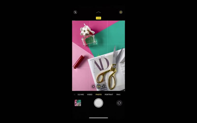
To shoot the layflats I place my surface directly under the window as you can see by the shadows in the scene. I played around with the placement of the objects and once I got them to a spot I thought was good, I snapped a few images. While shooting I am trying to keep my phone as level as possible. It helps to zoom in ever so slightly to avoid distortion in the corners of the images.

For the next setup, our table is placed directly under the window like before, but it’s a different time of day so we are now getting soft and indirect light. This setup is ideal for product photography. I start off by placing my objects and once I have them set, I bring in a white reflector and I place it parallel to the window. This allows the light to bounce off of the white surface and it creates a soft shadow fill. For a stronger effect use a silver reflector.

The last shot is a multicolored setup with a graphic kind of look. When shooting this entire demonstration, I made sure to use colors that would complement each other in a grid format. If you are a business or company there is no better way to display your brand than to choose similar colors throughout your feed and one to two color presets to keep cohesion. People will recognize your brand and be drawn to it because of the style and identity.

[EDITING] 1:35 – 7:28
After the shoot is complete we’re going to select our favorite images. I have already done so to save time. These are the three images I have selected. (Shown in video) The next thing I’m going to do is import these images into my favorite photo editing app that I’ve been using for years called VSCO.
I’m going to select the images from my camera roll and press import. Once the images have been imported, I’m going to select my first image and begin working on it.

Here you can see they have many presets for you to choose from and here are some of my favorites I’ve already used. I’m going to stick within this realm because I already know that I like some of these color palettes.

For this what we’re looking for is a good base because we’re going to edit it anyway to get the feel and aesthetic that we want. I really want to go for a pastel light airy look. I’m going to start off with this preset because I feel as though this is a good base. (DOG3) If you tap down on the screen you’ll be able to see the before and if you lift your finger off you can see the after.
The next thing I want to do is edit this image. The first thing we’re going to do is lift the exposure. Then we’re going to add a little bit of contrast. Then we’re going to add a little bit of sharpness. You can pinch with two fingers to zoom in so you can really see the detail. Next, We’re going to add a little bit of clarity. We’re going to click on tone to lift the shadows, but not too much. Next, we’re going to add a little bit of grain. I like to do this to add some texture to the image and kind of give it a film look. Once we have completed the edit, you can tap and hold to see the before and after. If you’re happy with this, which I am, we’re going to click next.
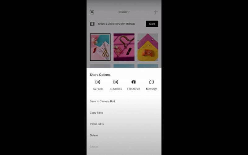
We’re going to save this as a draft. Now that we’ve completed our first edit, we’re going to select that image once again and we’re going to click on the three dots at the bottom right of the screen, where it says “more”. We’re going to Copy Edits.

Now we’re going to deselect the original image and select the images that we want to apply that color treatment to. We’re going to click down on More in the bottom right again and this time we’re going to select Paste Edits. Once we have our edits pasted, you can see the three images together as a whole. Our goal here is to make them look unified and to make them have all the same color, tone, and feel. The image I’m going to adjust now is the middle one with the perfume and the necklace. I’m going to tap just to show you the before and after.

The first thing I’m going to do is crop this image and straighten it out. The next thing I want to do is add a little bit of contrast. I would like to tone down the white balance just a little bit, to have the pink look more like the pink in the other image, which was a little more on the cooler side. Now I’m going to tap before and after, and you can also zoom in and tap before and after. Now that we’re finished with this, we can tap next and save as a draft.

The final image is the most challenging because as you can see, the colors don’t read the same as they do in the other images. So for this one, I’m going to not use this color preset, but maybe another one that I feel would be a better base for this image. I’m going to scroll down first through my favorites and see if I have anything that I think would work. I didn’t see anything there, so I’m going to go to all the presets. I feel as though this is a good starting base for this image. (E1) Now what I want to do is straighten it and crop it. We want to click ratio 3×4, so it locks and does not change.
[FINALIZING THE EDIT] 7:28 – 9:12
The next thing I want to do is just kind of mess with the settings and see if I can get it to look more like the other images. So I took down the contrast a little bit. I’m gonna click on tone to see if lifting the shadows would be good, and I do believe it does look better with lifted shadows. I’m gonna mess with the highlights a little bit. I’m going to press okay. I’m actually looking at my crop here and It’s not quite straight. I’m going to straighten this out a little bit more. Now I’m going to click on my before and after. I think this could actually use maybe just a little down on exposure. Now click next, save as draft.

I’m going to look at them together to check for cohesion. I feel the color story matches very well. The pinks look very similar. You have to keep in mind that the middle image is different lighting from the other two. The other one is softer, so the way the pink is going to read will be a little different. Overall, I’m really happy with how these look. Now I’m going to select all three of my final images, click on more, and save to the camera roll. And boom! We’re finished!
If you have questions about any part of the process, please feel free to ask. Thanks again for watching and/or reading this tutorial!


Get Connected!