-
Term: Color Theory
Description: Color theory in photography refers to the principles and concepts related to the use and manipulation of colors in photographic images. It encompasses the study of color harmony, contrast, saturation, temperature, and other characteristics that affect the visual impact and emotional response of an image. Color theory in photography also involves the understanding of color models and color spaces, as well as the technical aspects of color correction and color management in digital photography. The aim of color theory in photography is to enable photographers to create images that effectively communicate their intended message, evoke emotions, and engage viewers.
Color Theory
Color Theory Explained
It’s the word ‘theory’ that I believe turns most people away, especially as it intertwines the physics of light, physiology, and psychology. As photographers, we have a desire to just ‘do’ and just ‘create’ whatever is within, and theorizing doesn’t often come into play. How we learn photography today is so vastly different than before, and totally different to how art students learn, as for them, the importance of color theory is impressed unto them immediately.
Why didn’t we learn it? Probably has something to do with the fact photography didn’t use to allow as much for manipulation as current digital media, and was more about capturing the real world, so there may have seen little use. However, not knowing about it could be one of the biggest mistakes you’re making, or at the very least deserves even more of your attention.
I would propose that color theory is just the understanding of how colors interact, their mixtures and their implementation. Color is all around us so often that we fail to always notice much about it, other than the fact it’s there. But color, like photography, can be thought of as a way to communicate – a silent language, if you will, much like photography. It is the roof under which hue, value, and chroma reside, and we adjust those all day in post.
Hue refers to the color difference, with value referring to light and darker, and chroma references the brightness or dullness, and all can be seen on a color wheel. In fact, a color wheel is your epicenter for understanding color theory, as it helps us to understand the physical phenomenon associated with light, and how we see and use it. And since colors affect mood and atmosphere, and the psychological and physiological, (such as the fact red make us excited and blue calms us down), we want to marry this knowledge without images to tell a story, and create impact. The color wheel then, becomes your best friend.
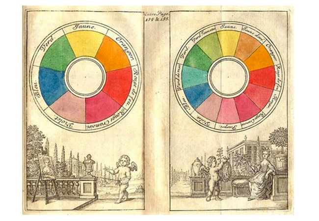
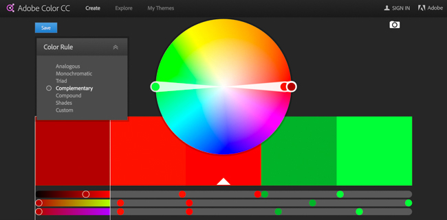
Color Wheel
A color wheel helps us understand the physical phenomena of light together with how it is perceived by our eyes and brain, and then use it.
*Adobe Color CC is a great tool to bookmark and keep on hand to see how colors work together, and you can find it here.

On a color wheel, you’ll see a color spectrum that shows all possible colors that can be created via the mixing of Red, Green, and Blue – the primary colors. There are, in a sense, an indefinite number of colors between, but convention dictates that there 9 secondary colors, and the rest deemed tertiary. Now, I wouldn’t think that remembering all 9 secondary colors matters as much, but what you should really take away and look to the color wheel for, is to see how two colors can be complementary.
Complementary colors, according to the unfaltering pillar of knowledge that is Wikipedia, are colors which cancel each other’s hue to produce an achromatic (white, gray or black) light mixture. Essentially, they are just colors that seem to appeal to our sensibilities of what is harmonious and appealing, and all you need to really know is that a complementary color can be found by locating the color use on the color wheel, and then finding the one that’s directly opposite it, and there you have it.

It’s really that simple, but it’s that profound. The use of complementary colors can be found in just about every great image and a scene of color. Who can forget the image of Grace Kelly lounging in a reddish-orange blouse reading Harper’s Bazaar as James Stewart uses his telephoto lens while lounging in his blue pajamas? Or in the case of Top Gun, the orange afterburner of the Tomcats against the deep blue skies.
Or how about almost anything from Steve McCurry? Many of you will immediately think of ‘Afghan Girl’; the image of the young one with piercing green eyes that look into your soul. It adorned the cover of National Geographic and earned the nickname, ‘the First World’s Third World Mona Lisa’. Looking at it, you’ll notice two colors shouting for the attention they deserve, and that’s how impossibly red her scarf is mixed with the green eyes and green background. Green and red are complementary, so it works, and oh so well. Imagine if her shawl had been red and the wall purple, it would’ve been striking, but possibly not as incredible.
And that’s how it is, that color alone can make or break an image. It can guide a viewer’s eyes to tell a story or change the mood. And one thing that can separate the good photographers with consistency from the ones with none, is the consistent use of color theory; They don’t leave it to chance, or at least they recognize it, but typically make a conscious effort to control all elements within the frame, and color being one.
Color Theory Tips
To get more practical about it all, here are a few things to think about and try:
- First, if you have an idea for a shoot, and maybe you take notes about it with a checklist for things to carry, timing, and so on, just write down ‘Color’ and underline it. I have done this and it’s just the tiny reminder to think about it and not leave color to chance.
- Try choosing the complementary color combinations using clothing and background, like ‘Afghan Girl.’ Maybe put your subject in a yellow top, and shoot against a blue wall or sky, or balance the make-up highlights of a headshot with the color of the subject’s eyes. Know someone with green eyes? Great, stick em in front of your lens with a dark background, and wrap them in a red scarf with their hair pulled back, and get in nice and tight to bring focus to the features you want.
- Try a monochromatic shoot, and I don’t mean black and white. Monochromatic refers really to different values and intensity of the same hue – think various shades of one color, and pick a color to either enhance a mood or in stark contrast to the expression.

Also, it really warrants saying that one of the major problems with average photographers today is the notion that oversaturating an image makes for a more poignant image, but that’s akin to saying something stupid really loudly – you get noticed quickly, but then people realize what you’ve got to say is rubbish and move on. Oversaturated images look very fake, and jarring, and that makes for a difficult image to sit with, as the eyes aren’t allowed to rest. So you can play with making the intensity of colors in certain areas in your image greater or more muted than others.
With all of this, it warrants saying that these are guidelines, and don’t let that take away from your creative license, it’s yours so use it. Just make sure that what you’re doing is deliberate and thought through, as that always comes across.
If you have greater interest in this, I will be happy to go further into detail about these fundamentals, and we do go over the fundamentals that often get missed or overlooked in Photography 101, which should really not be missed. Most photographers or budding photographers I see today won’t get far because they miss these fundamentals and, therefore, try to build a castle on hut’s foundation. Don’t be one of them. And don’t be afraid to use Lightroom or your post-processing software to test it all out.
Related Articles to Color Theory Definition
4 Ways to Incorporate More Color Into Your Photography
Want to learn how to capture vibrant colors in photography? Here are 4 ways!
Learn Color Theory & Application The Pixar Way | For Free
It’s hard to think of any other source better or more fun to learn from.
Learn A Thing Or Two About Color Theory From Disney’s ‘Beauty & The Beast’
Want to start mixing color in your scenes – be our guest!


Get Connected!