
The bold, vivid photo editing is one of the most popular editing styles in photography. This style maintains the natural colors while bringing out the colors in the image. In this tutorial, we will show you how to use the Vivid Color Lightroom Preset and the HDR Vivid Color Lightroom Preset if you own the SLR Lounge Preset System. For those of you who don’t own the presets, we’ll show you how to create them manualy in the last part fo the tutorial.
Vivid Color Lightroom Preset – The SLR Lounge Preset System
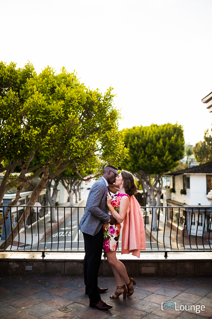
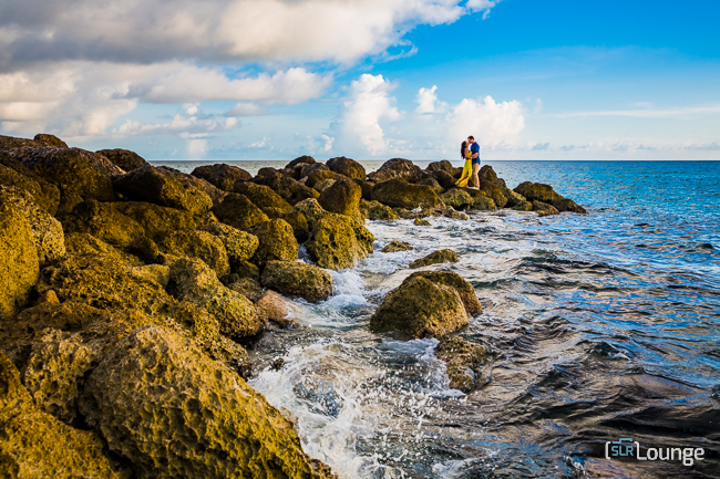
Perfect For Environmental-Style Portraits
The Vivid Color Lightroom Preset is ideal for environmental-style portraits. It’s a perfect preset for wide-angle portraits, and also, detail images.
Our Mixology
1. Foundation: Dramatic Color + Skin Desat
2. Definition: Harden
3. Definition: Contrast Boost – Medium

Before Applying Preset

After Applying Preset

Before Applying Preset
After Applying Preset
HDR Vivid Color Lightroom Preset
Bringing Out Those Colors
This type of Lightroom preset is typically used during wide dramatic, “landscape-esque” photos. It lifts the shadows, brings out the color, but will make skin-tones funky if the shot isn’t wide enough.
HDR Vivid Color | Lightroom Preset System 2015
Click to Subscribe!
Our Mixology
1. Foundation: Dramatic Color + Skin Desat
2. Base Tones: HDR +++
3. Definition: Harden +
4. Definition: Contrast Boost – Max
5. Definition: Dehaze +

Before Mixology Applied
After Mixology Applied

Before Mixology Applied

After Mixology Applied
Before Mixology Applied
After Mixology Applied
How to Create Your Own Vivid Preset
If you don’t own the SLR Lounge Lightroom Preset system, we recommend creating your own by following the steps below.
The Basic Panel
To create our Standard Color Preset for the “vivid landscape” look, first select a typical landscape image that you would normally shoot. Below is the image we will be using in this tutorial.

Next, we are going to reset our image to the Standard Import Preset, which is located under the Presets Panel on the left side of Lightroom. As you can see below, we have selected the “Standard Import (Reset)” Preset.

Once we have applied the Standard Import Preset to our image, we are going to make adjustments in the Basic Panel. The Basic Panel is on the right side of Lightroom. To expand or collapse this panel, simply hit “Ctrl + 1.” First, we need to adjust the exposure of this image because it is slightly underexposed. When you create a standard preset, you should always start with an image that is properly exposed because you will not dial in the correct settings when you work with an incorrectly exposed image. So for example, our image is too dark. When we dial in our settings, our settings will not be correct since the original image is too dark. To fix this, simply dial in what the proper exposure of the image should have been. In our example, the image is 1 stop underexposed so we are going to pull up the Exposure to +1.

We now have the proper exposure for our image, based on the skin tones and the details of the image. Once we have fixed the exposure of our image, we can start dialing in the settings. When we are done adjusting the settings, we can reset the Exposure back to 0 before we save the Standard Color Preset.
Once we have the correct exposure for our image, we can start adjusting the settings. Bring the Contrast up to +25 to create a poppy look for the image. Next, we are going to leave the Highlights and Shadows as is from the Standard Import Preset. Then, we are going to dial down the Whites to -20 and bring up the Blacks to +20. When we pull down the Highlights and bring up the Shadows, we can increase detail in the sky without blowing it out as well as increase detail in the Shadows. In other words, we are boosting the dynamic range in our image. See below for an example.

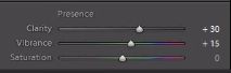
Next, we are going to add a little more clarity since this is a landscape image, so bring the Clarity up to +30. Adding clarity will bring out additional details and Midtone Contrast in the image. Next, leave the Vibrance at +15 and the Saturation at 0. If some shots are already very saturated, we do not want to oversaturate those images by boosting Vibrance and Saturation too high. See below for an example.
The Tone Curve Panel
Next, we are going to go down to the Tone Curve Panel, which is located right under the Basic Panel. Hit “Ctrl +2” to expand or collapse this panel. We are going to add a slight S-Curve to the Tone Curve by adding 4 points in each quadrant. We will pull up the Shadows, Midtone Shadows, and Midtone Highlights. Then, adjust your Whites down a little bit. Your Tone Curve should look like the one below.

The Detail Panel
Once we have adjusted the Tone Curve, go down to the Detail Panel, just a couple panels under the Tone Curve Panel. You can hit “Ctrl + 5” to expand or collapse this panel. For this particular preset, we are not going to adjust any settings for the Noise Reduction. The settings for Sharpening is a good default so we will leave those settings as well.

The Lens Correction Panel
Next, go to the Lens Correction Panel, which is right below the Detail Panel. Hit “Ctrl + 6” to collapse and expand this panel. We do not need to make any adjustments to the Lens Vignetting settings.

Creating the “Vivid Landscape” Color Preset
Now that we have finished dialing in our settings, we need to save this preset as our Standard Color Preset for our landscape images. But first, we need to go back to the Basic Panel (“Ctrl + 1”) and reset the Exposure to 0 so that this exposure setting is not included in the Standard Color Preset.

After we have reset the Exposure back to 0, we can create our new preset. Go to the Presets Panel on the left side of Lightroom and click on the “+” sign.

A dialogue box will appear, like the one below. We are going to name this preset “21 Standard Color.” Then we are going to hit “Check All” to select all of our settings. However, deselect “Lens Correction,” “Lens Profile Corrections,” “Transform,” and “Chromatic Aberration.” Then hit “Create.”

Once you hit “Create,” our Standard Color Preset will appear under the “Vivid Landscape” category. As you can see below, our Standard Color Preset is underneath the “Vivid Landscape” category.

Below is our final image with the “Vivid Landscape” Standard Color Preset applied.

“Vivid Landscape” Color Preset vs. “Soft Portrait” Color Preset
In our next image below, we have applied the “Vivid Landscape” Color Preset so the image has a nice poppy look.

If we apply the “Soft Portrait” Standard Color Preset to the same image, you cannot see as much detail in the overall image.

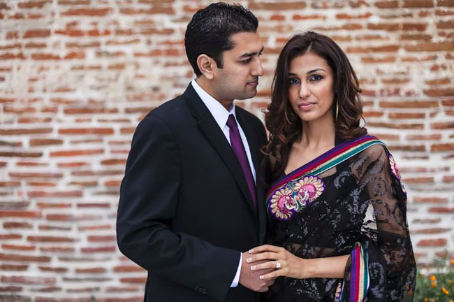
Likewise, we do not want to use the “Vivid Landscape” Color Preset on portraits. In our portrait below, we have applied the “Soft Portrait” Color Preset. As you can see, we have a nice flattering look to the image.

However, when we apply the “Vivid Landscape” Standard Color Preset to the same image, our image does not look as nice. As you can see, this preset is harsh on the skin tones. Not only have we brought out extra detail in the skin tones, but the skin tone highlights look over dramatic, whereas the “Soft Portrait” Standard Color Preset had a softer look. This is why we need to create 2 separate categories: 1 for a vivid look for landscape images and 1 for a soft look for portrait images.
When to Include Exposure in Standard Presets
The only time we would actually adjust the exposure and save that exposure into a standard preset is when we want that exposure to be a part of the preset itself. For example, if we want to create an overly brightened blown out look for our images, we would dial in the exposure and save that exposure setting into the preset. So basically, if we do not adjust the exposure in the preset, then we need to adjust the exposure after the preset has been applied to an image. If we already have an exposure setting dialed into the preset, then the final image should be overexposed once you have applied the preset.


Get Connected!