
Are most of your wedding albums squares, verticals, or horizontals? Did you have specific reasons for deciding the orientation? Is it okay to have your photo albums vertical and still use horizontal pages? In this article, we will discuss the pros and cons of each different orientation and hopefully it will help you figure out exactly which one to choose next time. Before we get started, let’s define a few terms. Landscape is the same as horizontal, portrait is the same as vertical and square are just squares.
Square Albums – The Most Versatile Orientation
Back in the days, most antiquated “slip-in” wedding albums were square shaped. It was done on purpose because it allowed the slip-in mats to “rotate” and provided more versatility for the mats. Nowadays, with modern flush mount wedding albums, this no longer applies, but we still see a huge popularity with squared-sized wedding albums.
One practical reason for square wedding albums is that they are extremely easy to resize. Simply design a large size wedding album and you can order any other smaller square sizes without lifting a finger! No need to worry if the aspect ratios are compatible or not.
Design wise, square albums fall into the “middle-of-the-road” category. If you have a nice landscape image, it can fit perfectly across a full spread (2 squares). Other than that, if you try to full bleed either a horizontal or vertical image into a single square side, you would need to some heavy cropping. Fitting multiple images into a single square side is also a labor of compromise. Let’s say you want 4 horizontal images on a single square side….you would wound up with some awkward space on the top and bottom. Likewise, fitting 4 vertical images on a single square side will yield awkward space on the left and right side.
If you are offering parent albums at different sizes, square will be the easiest and most versatile album orientation.
Vertical Albums – The Least Common Orientation
Vertical wedding albums are a bit challenging. When done right, you will have a very unique shaped wedding album that stands out from the crowd. When done wrong, your bride might drop the dreaded comment, “Oh, that looks like a yearbook…”. (Well, it would certainly be one costly yearbook!)
Vertical wedding albums should be sized LARGE to give the impression of a “fine art” book. If sized small and thin, then a vertical wedding album may bring back memories of our high school yearbooks. (Go Skyline Titans!)
The vertical wedding album presents more challenges in the design department. If you happen to shoot 90% of your images in a portrait format, then there are no issues; however, for most wedding photographers, they have a mix of landscapes and portrait formats. This is where the design can be challenging. Putting a single landscape image on a vertical side can be tricky, not to mention a big waste in space.
The vertical format is also a bit challenging for your eye movement. When constructing a story on a vertical spread with multiple images, naturally, one would place the images from top to bottom on both sides. Your eye movement would have to go from top to bottom on the left side, and then back to the top on the right side and then head towards the bottom.
Horizontal Albums – The Most Impactful Album Orientation

Let us be upfront: we have a bias towards horizontal designs. When multiple images are laid out across a full horizontal spread, your eyes simply have to travel from left to right without any awkward transitions. A single landscape image fits nicely onto a single horizontal side, leaving you with the other side for supporting images. To achieve a high visual impact, simply use a single landscape image and have it span the full spread.
From our experience with designing a few thousand albums, we have also noticed that you can squeeze in more images into a horizontal design and not have it look as “crowded” as with the other orientations. This is especially a big plus for those brides who want a lot of photos but do not want to upgrade their album!
Conclusion and Opinion
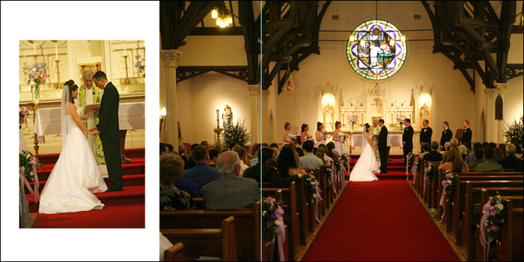
There you have it! Our completely biased diatribe on wedding album orientations. As always, your mileage may vary – just experiment and have fun! Below, we show you an example of how we utilized two images in a square, vertical, and horizontal design. In our opinion, the most impactful and interesting layouts are possible with horizontal (landscape) layouts. They allow for wide, impactful images as the central focus, with other supporting story-telling elements to the left and/or right of the main image. Our least favorite is the landscape format, which is difficult for laying out large environmental portraits. The most versatile and easy to scale up and down is the square size.


Get Connected!