
Being a man, I’m often apprehensive to pull someone aside and ask for help or an explanation, because this might imply that they are somehow more clever than me. With directions the need is lessened now, thanks to GPS on cell phones, but the odd time I have to, I have a system. If they launch into a set of militaristic directions using words like ‘meters’ or ‘tree-top,’ I glaze over and drive off; If they hesitate for a millisecond, or a remote look of perplexity even faintly comes over their face – I drive off. It may actually be worse with tech explanations because the informer, with their phones on their hips and pleated khakis, often has this holier than thou ‘Let me break it down for you, Stupid’ look and tone. This is precisely what happened to me when I asked a printer to explain CMYK vs. RGB at a lab in the UK last year. I’ll try to spare you the same.
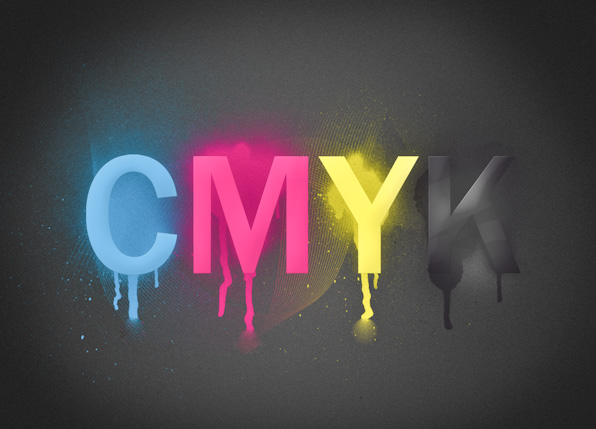
What is CMYK?
CMYK is an initialism for Cyan Magenta Yellow Key (black). It refers to a subtractive color model, and process itself, of color printing. The K stands for Key, and represents black as the CMY colored plates are aligned with the black Key plate. This stems from old printing processes. And though this does vary depending on the company, the colors are usually applied in the order of the initialism.

The model is referred to as a subtractive because each color subtracts brightness from white. In an RGB model, it is the opposite where each color adds to the brightness from dark. A good way of thinking about this is picturing two mediums: white paper, and a computer screen.
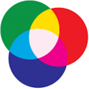
While printing CMYK model on white paper (standard), each addition of color cuts down on reflected light, and as each of the three colors are layered on top of the other, you will have a very dark, semi-black, muddy shade. (The black is added for upped contrast and more true blacks.) In the RGB model on a computer, the colors are created with light, each added color adds to the brightness and goes towards white. RGB is used for light reflection, and CMYK for light absorption. So, really we are talking about the way light interacts with the medium at hand.
[REWIND: Understanding the Lightroom Histogram and Using It To Process Images – Lightroom Image Processing Mastery Workshop]
Something To Consider:
It should be understood that your eyes have a visible spectrum that’s in the billions of colors. A computer monitor can display millions, and really high quality printers can display/produce in the thousands. This is often problematic in printing digital media since what you can see on the screen isn’t quite what you’ll get on the print. Millions of the possible displayed colors on a monitor are going to be outside the spectrum that a printer has available. When designs or digital media are generated using the RGB model, in order to attain proper color rendering the colors used must fall into the CMYK spectrum.

Why Do Colors Change During the Shift From RGB to CMYK?
As touched upon, there is the difference in the color spectrums that can be produced. RGB having more, so when it’s converted to CMYK there’s somewhat of a loss. Apparently ,the most obvious losses are in brighter and shinier colors, like bright blues and metallics.
Oh Yeah…There’s PMS
By this I am referring to the Pantone Matching System which is essentially solid color matching system that’s used in offset printing, and designers can use PMS colors and a standardized reference since due to the discrepancy between on screen on printed material. Pantone has formula guides that illustrate PMS colors together with how they will appear when produced using CMYK inks. This essentially lets you see what the PMS colors will look like once printed on a CMYK printer. It’s a colored ink that’s mixed to offer a near perfect match to colors in the Pantone color guide.
Does This Matter To Me?
The honest answer is, I don’t know. Each case will vary, and if you’re not really printing a lot, or not printing for highly discerning clients or publications, then this may not matter a bit. There are clients who will ask for files to be calibrated for CMYK. You can do this right from the start of a project or after in most editing programs like Photoshop, by converting the workspace to CMYK. It’s important to note that all monitors are different and won’t be calibrated the same, so color rendering will be different. Working in CMYK mode may affect your filter use in Photoshop, and it may seem to display a few colors differently, like the metallic and bright colors mentioned above. However, you’ll at least be seeing a more accurate representation that will be much closer to the actual printed product.
Check out our Lightroom Workshop Collection v5, your complete Lightroom education and tools needed for any photographer (of any experience level) to run a full studio using Lightroom.


Get Connected!